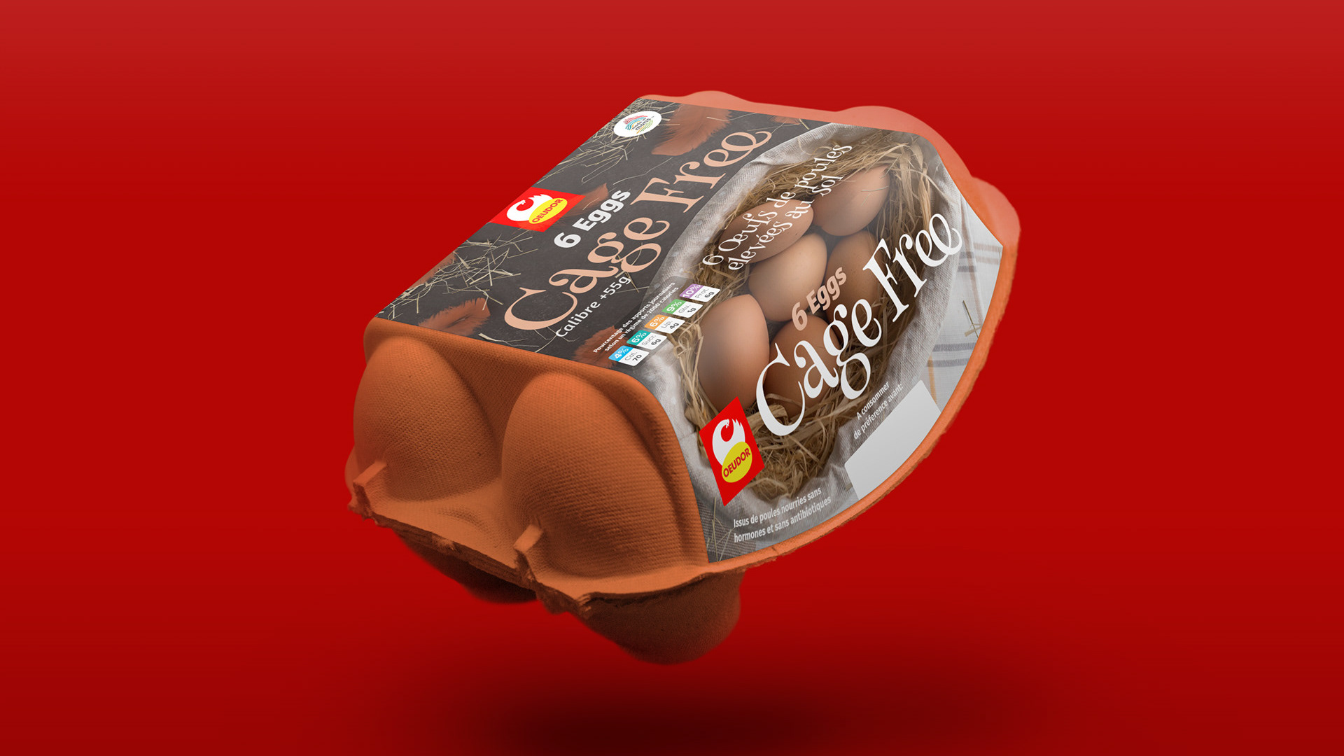
It's one thing to design a package, but it's another to design the home it lives in at the supermarket. This project was a proposal for Oeudor, exploring how we could help their brand command attention right at the point of sale.
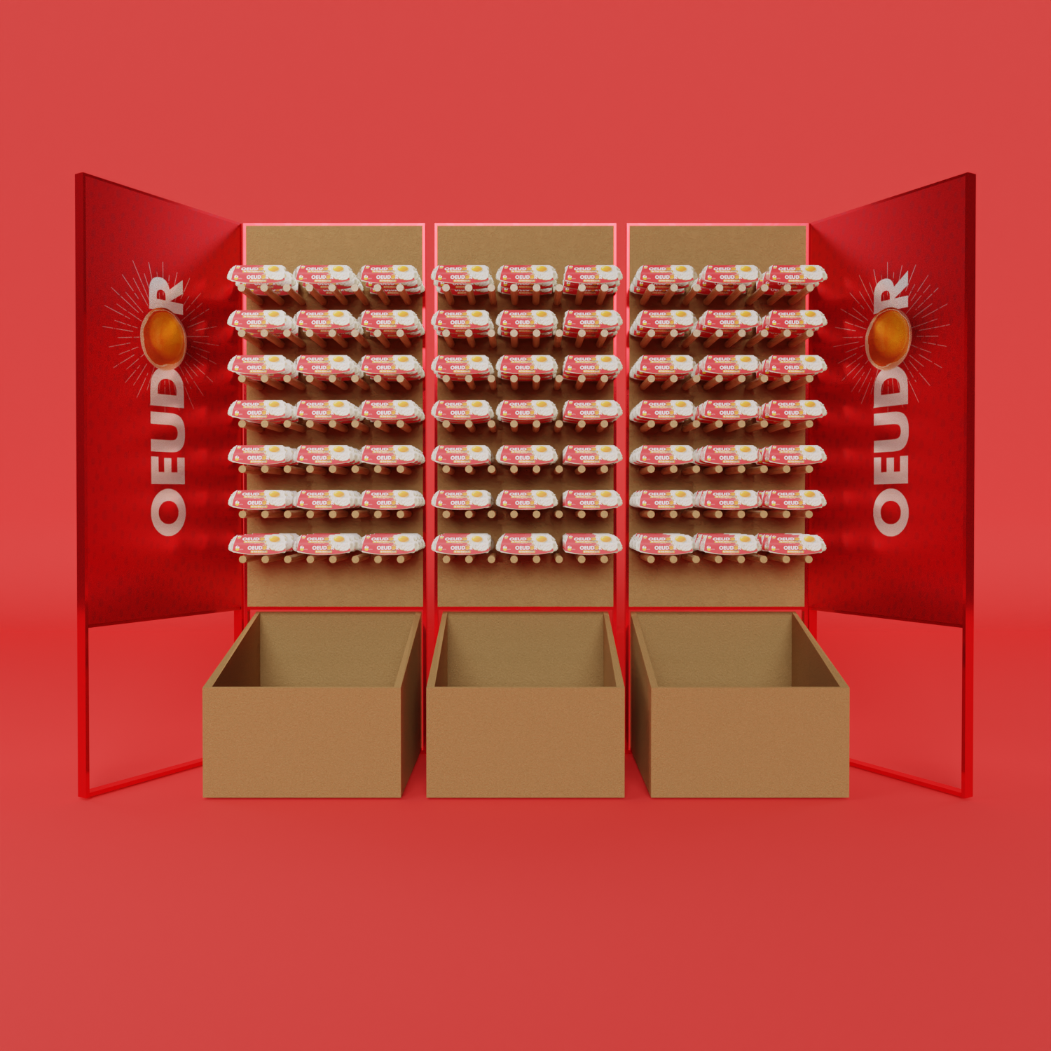
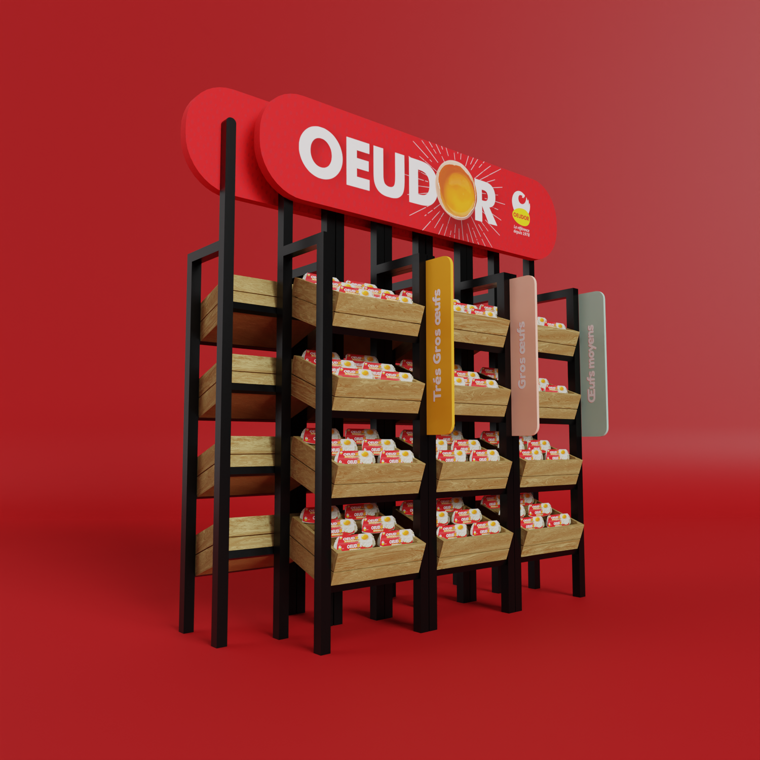
The goal was to develop new shelf and display concepts that would give the Oeudor brand a stronger, more organized presence in stores. I created two distinct strategic directions for them to consider. The first concept was a bold, red "brand wall"—a high-impact display designed to create a massive block of color and visibility in a busy aisle. The second idea was more of a permanent fixture that felt like a modern farmer's market stall, using wood crates and a steel frame to create a more premium, rustic feel while also helping to separate the different product sizes.
This was a fun exercise in thinking about a brand in three dimensions. It’s all about considering that final moment in the customer's journey and exploring how design can make the brand feel more tangible, organized, and inviting.