Designing a logo for a holding company is a unique challenge. The mark doesn't just need to represent one business; it needs to serve as a powerful parent brand—a seal of approval that unites a diverse portfolio of subsidiaries, from airlines to resorts. This was the strategic core of my identity proposal for Airport Holdings Limited (AHL).
Concept 1:
The network.
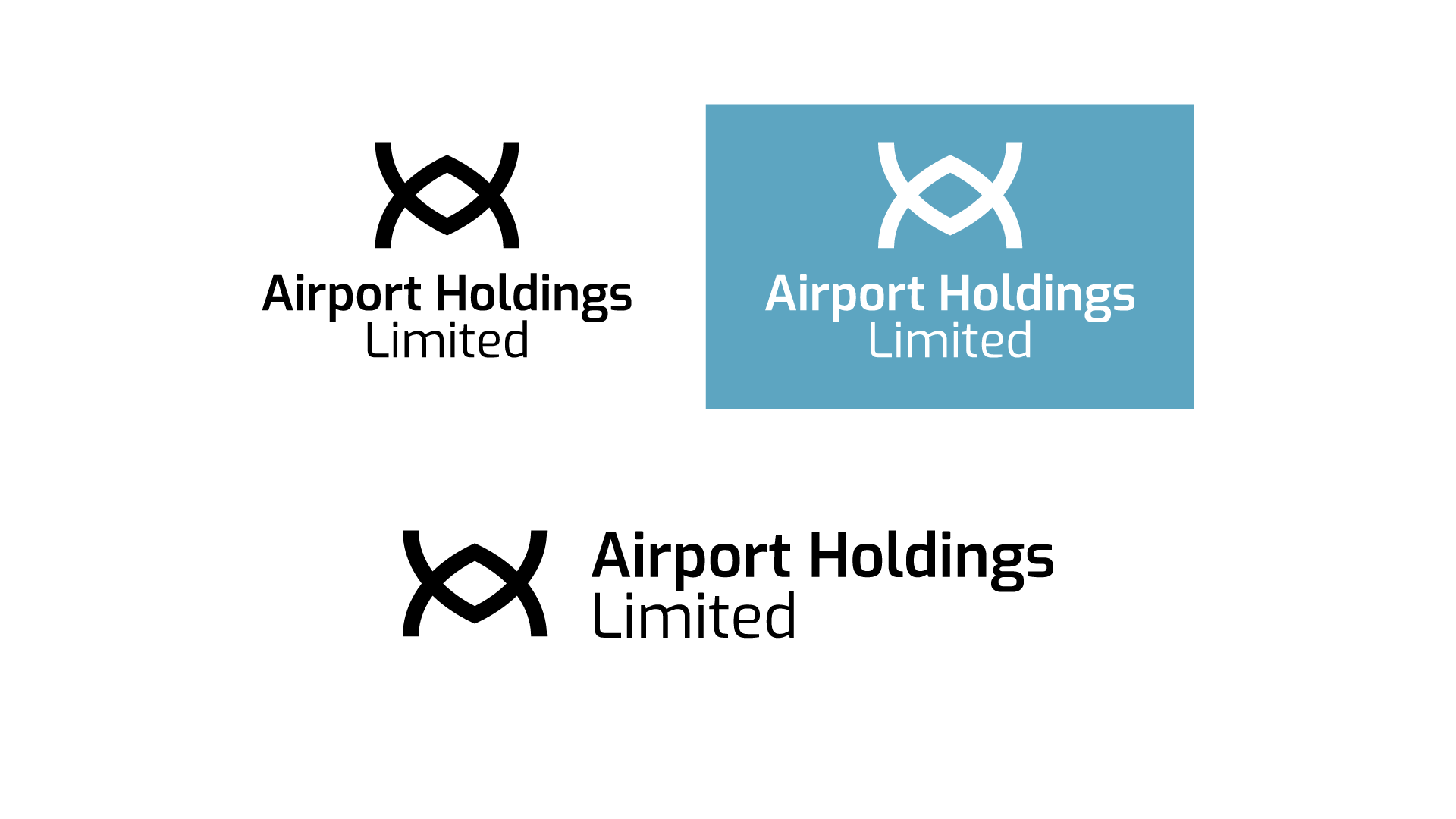
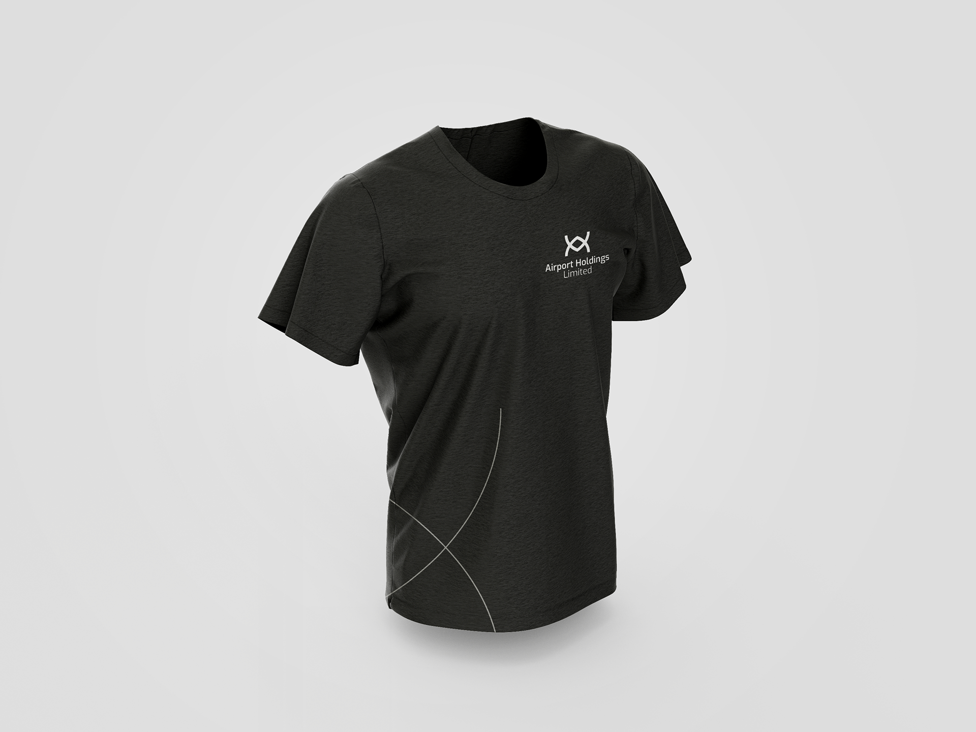
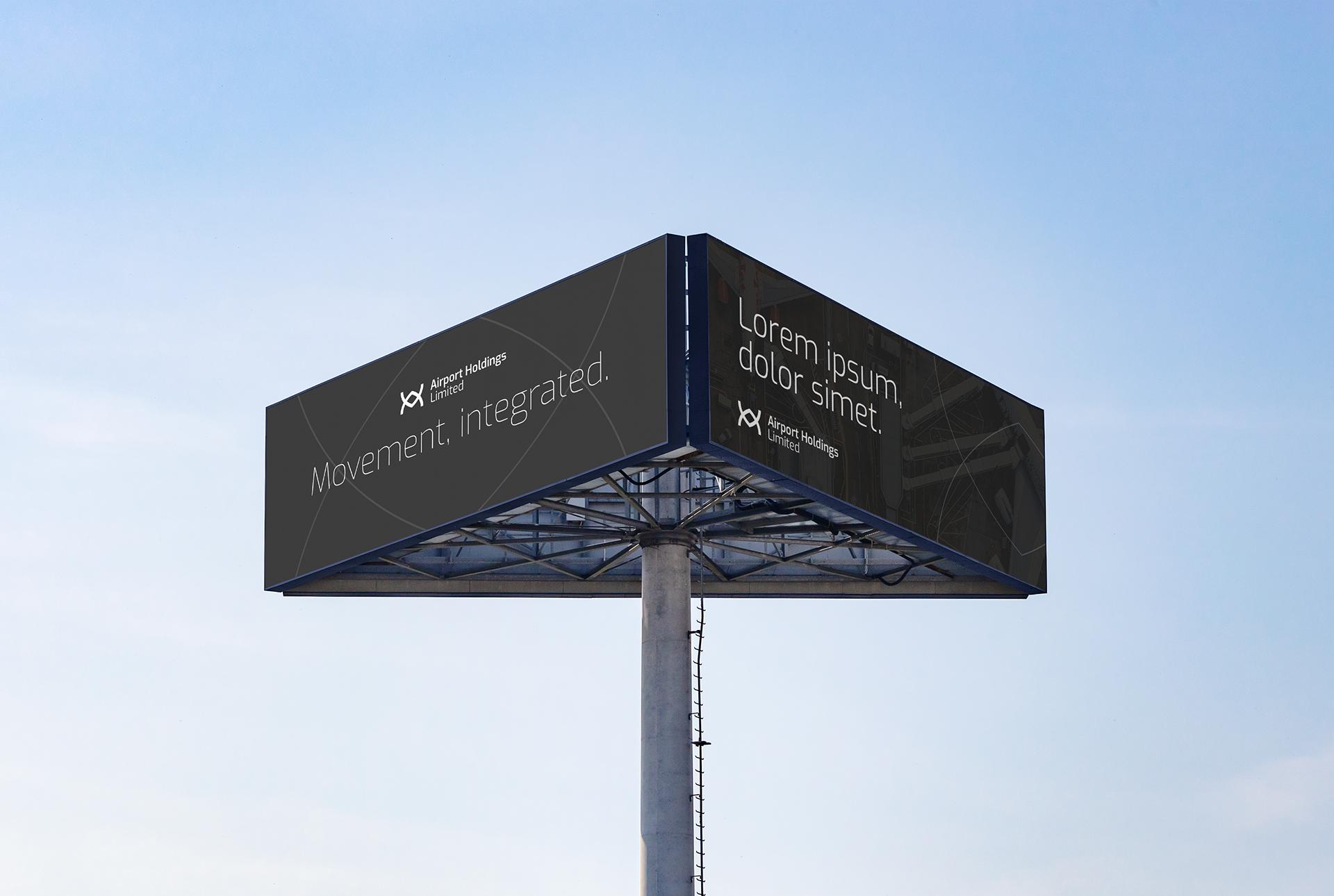
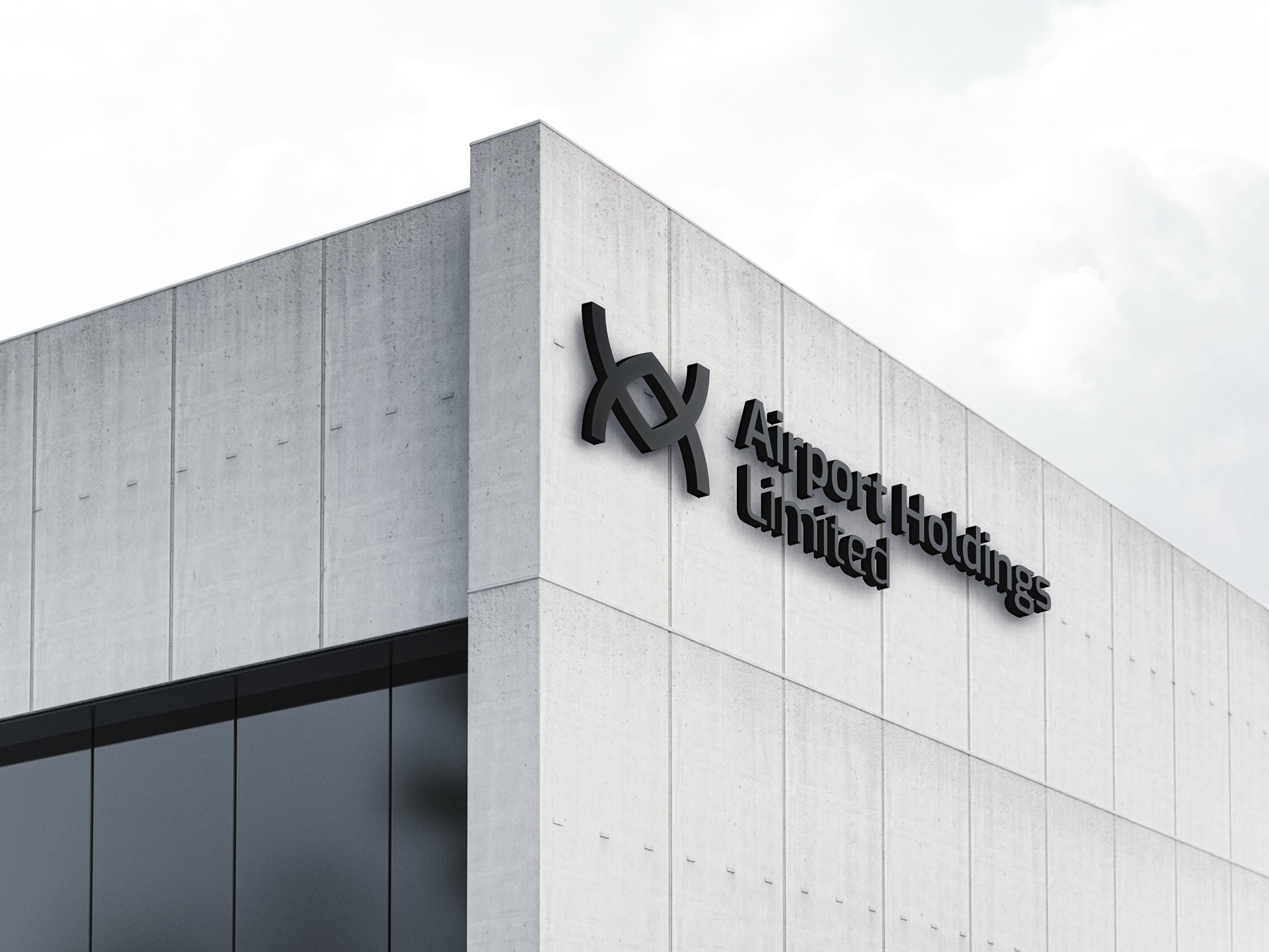
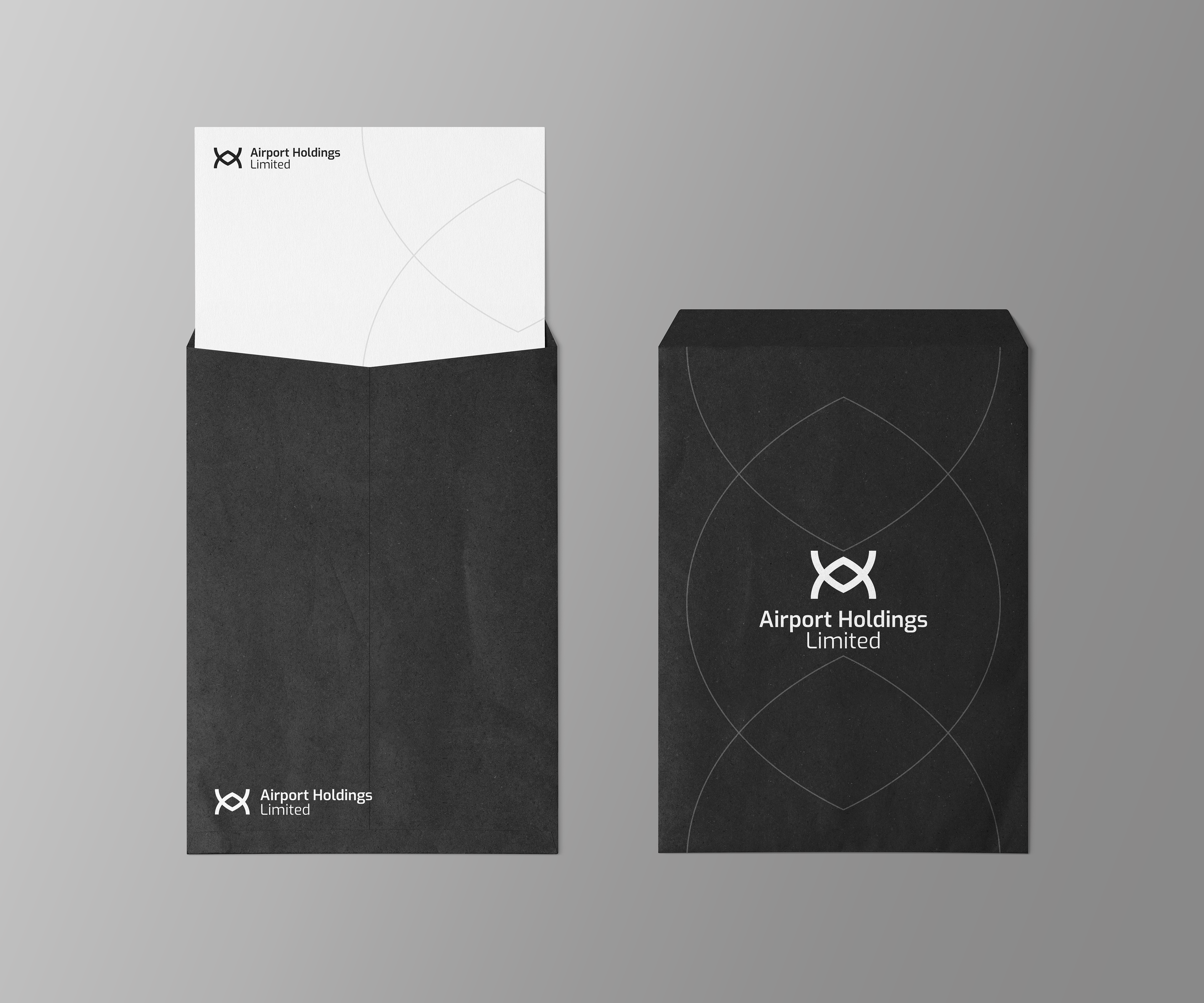
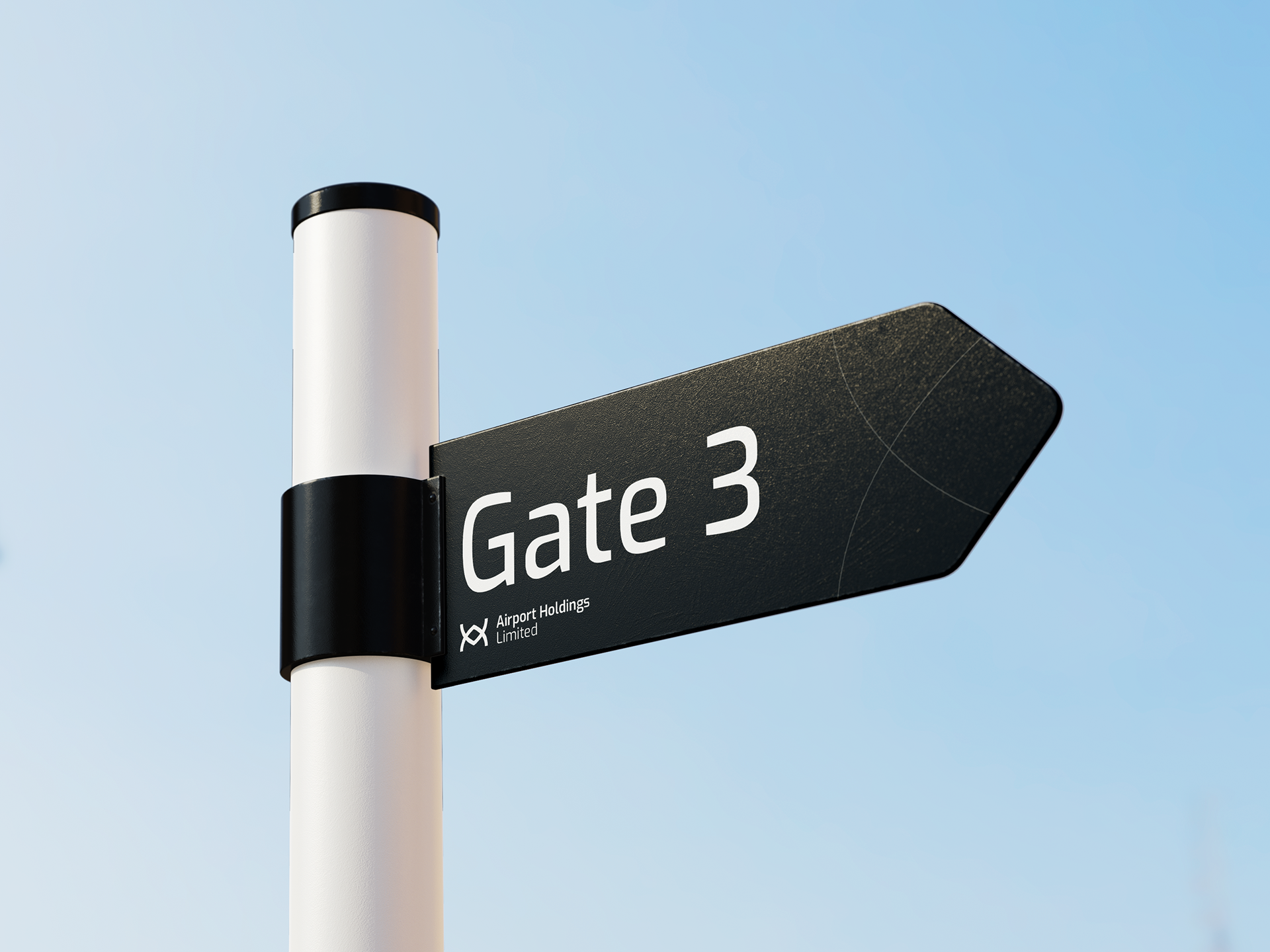
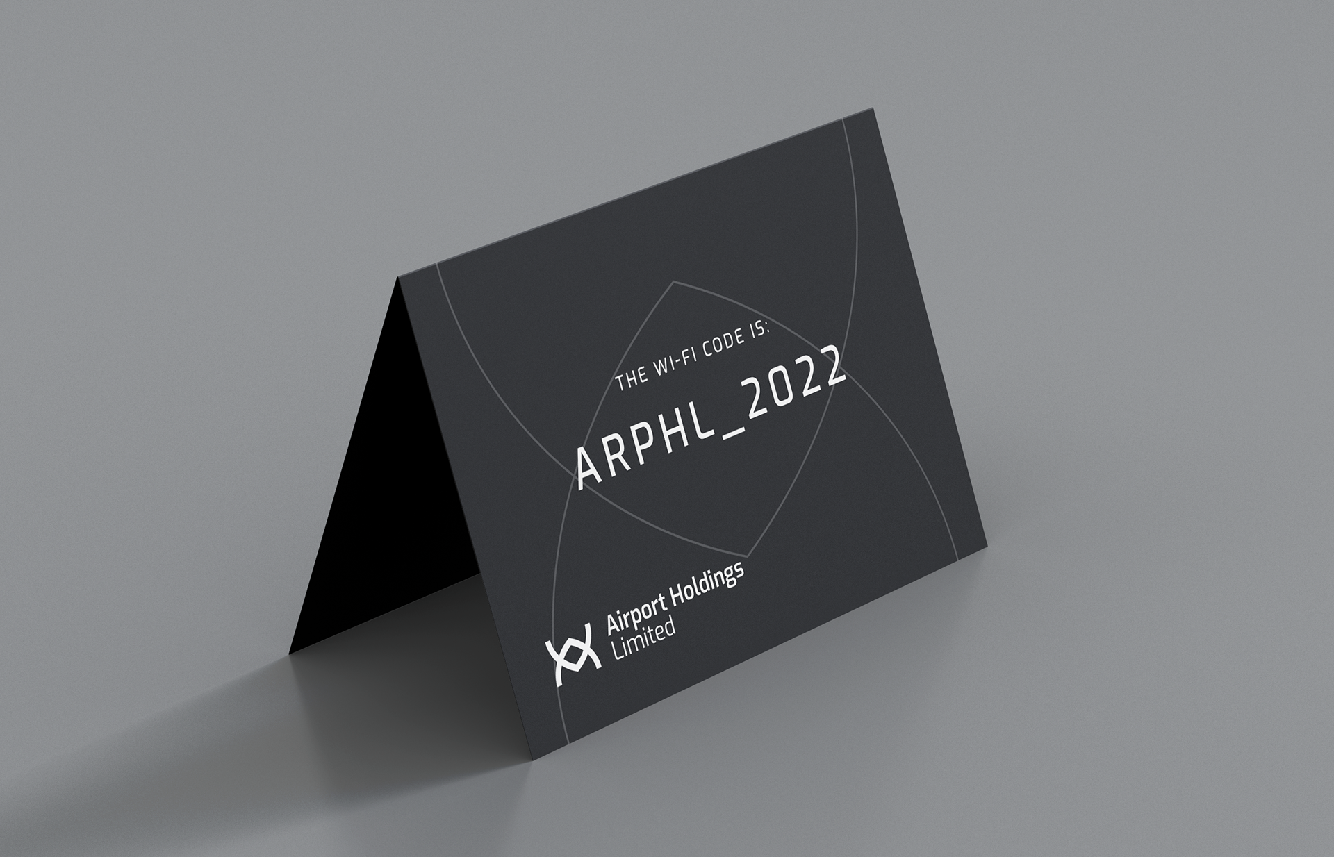
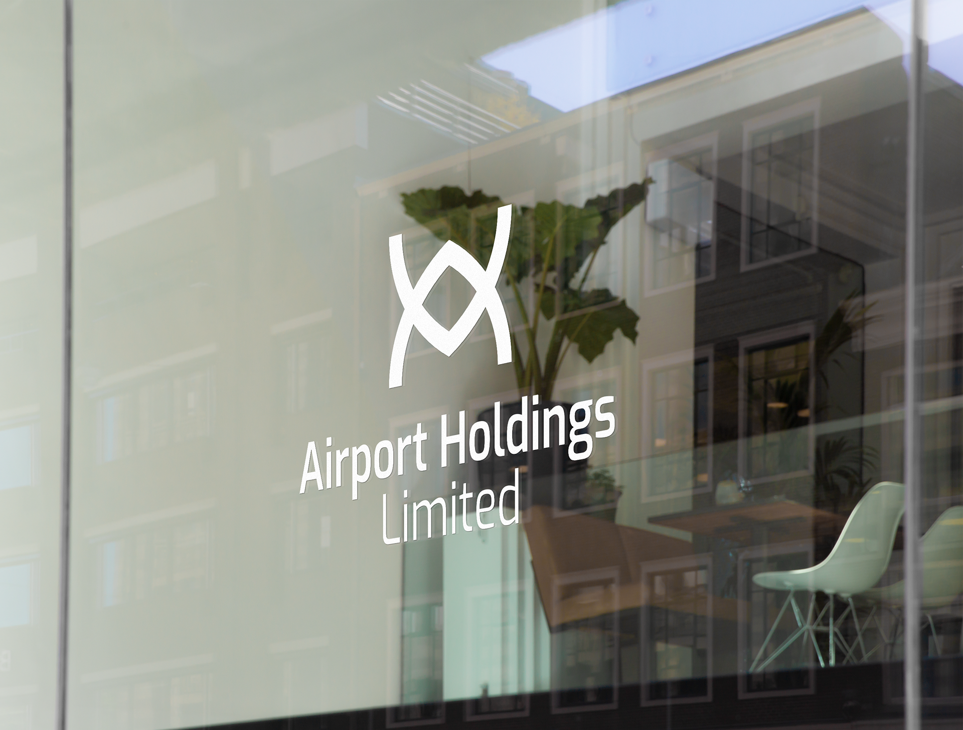
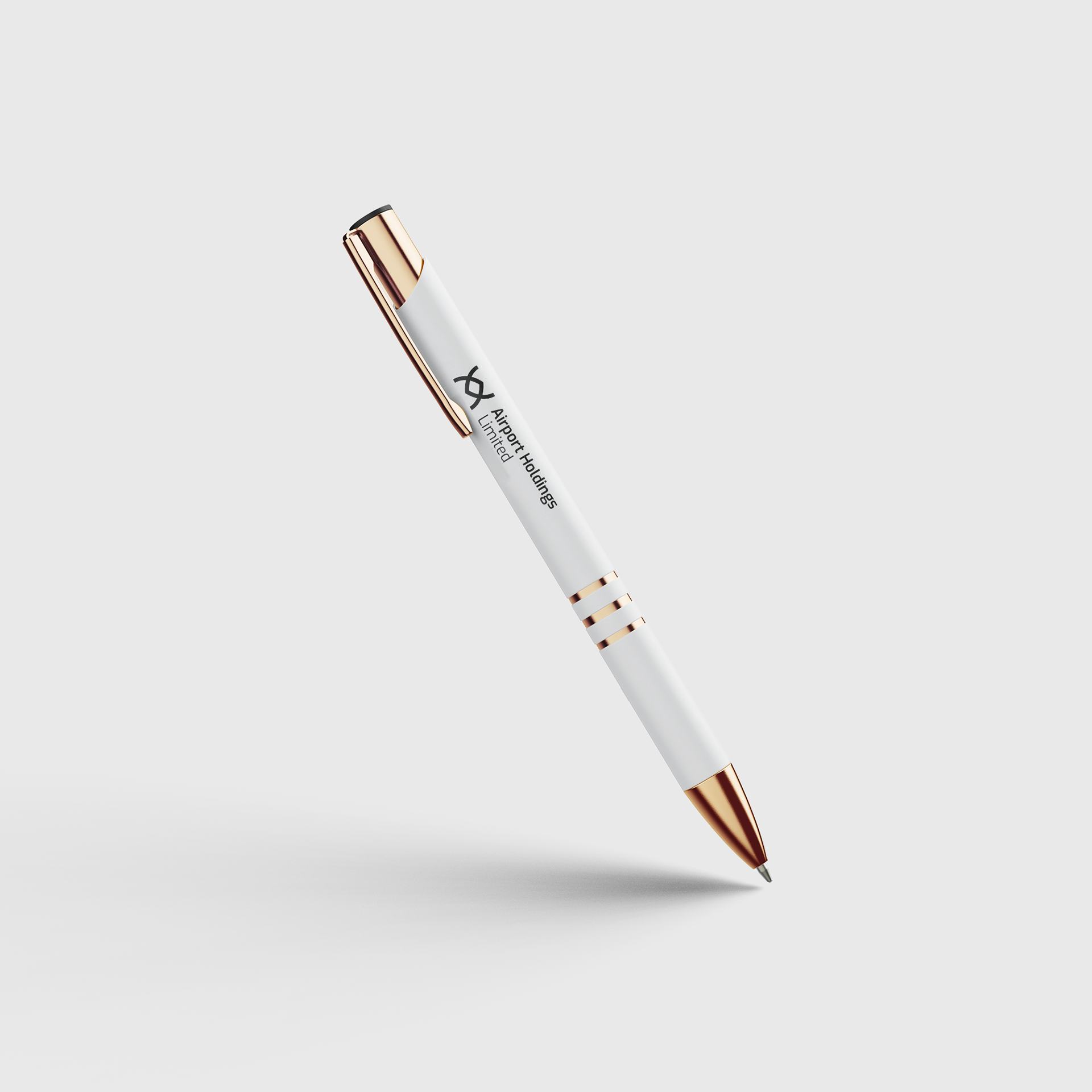
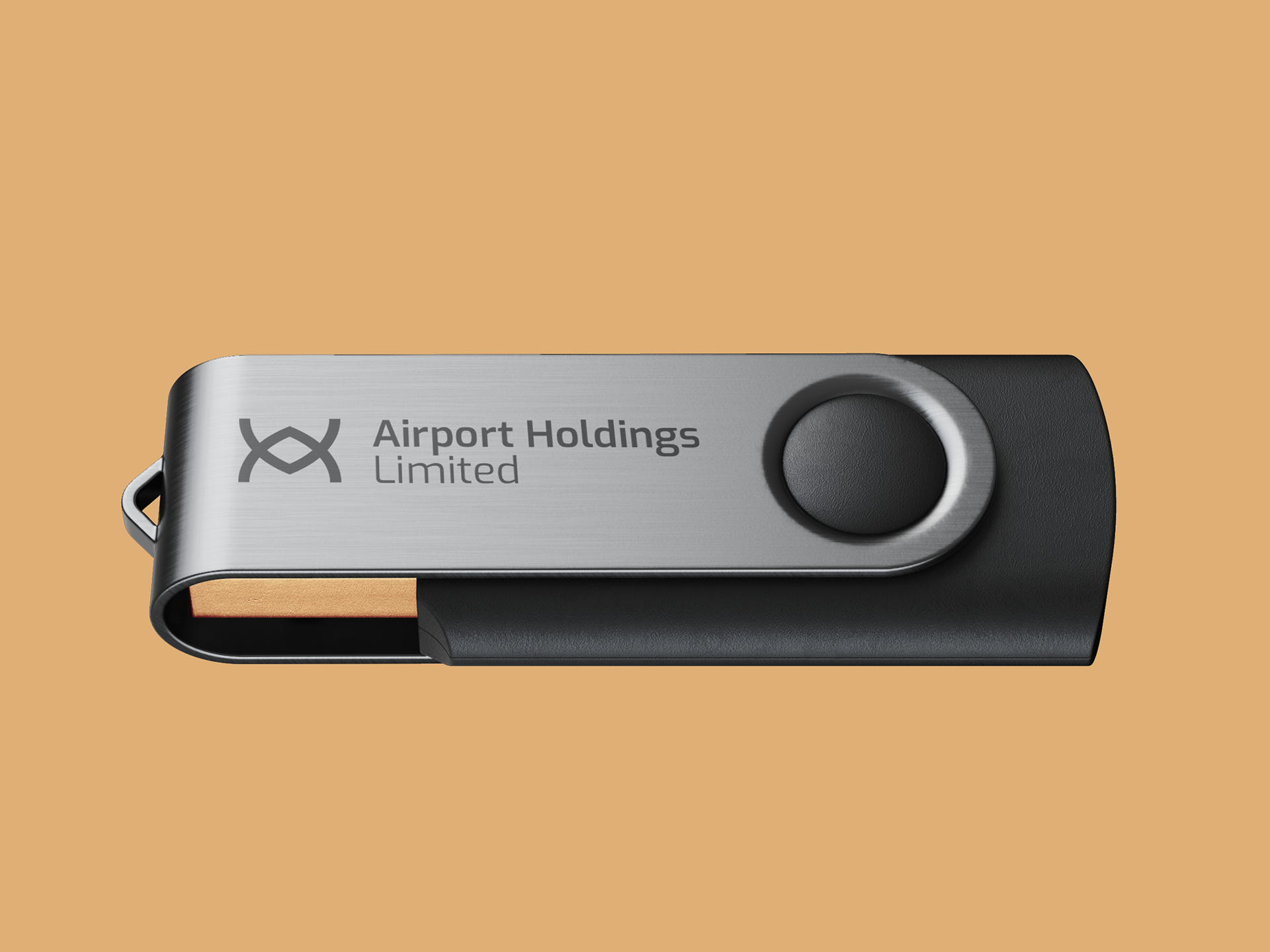
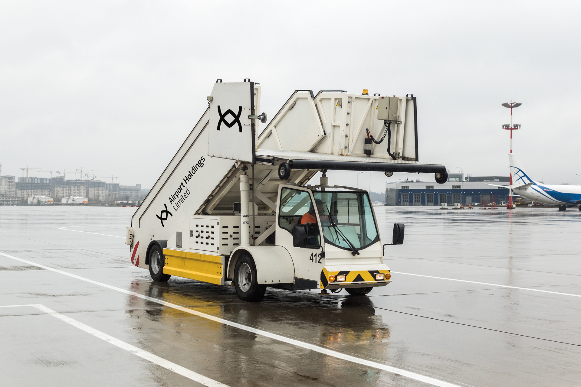
This direction was built around an abstract mark of two interlocking links. Drawing inspiration from network grids, chain links, and transport interchanges, this logo was designed to communicate partnership, integration, and the seamless movement between AHL's diverse holdings. It's a sophisticated mark that speaks to a modern, interconnected identity.

Concept 2:
The Structure.
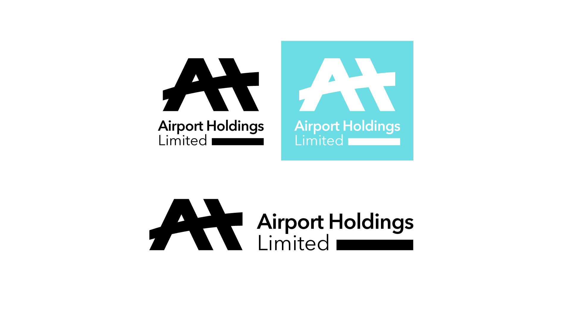
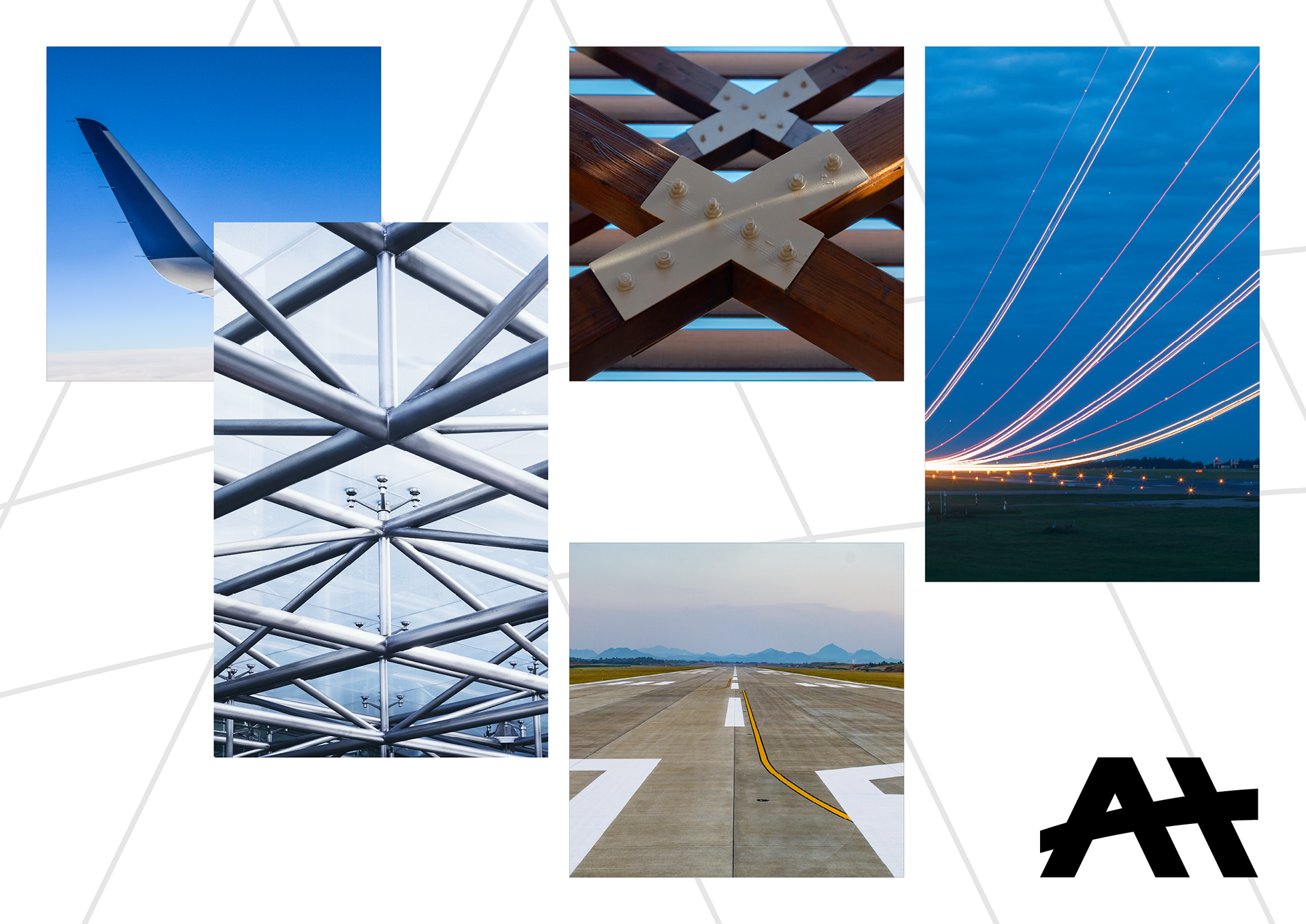
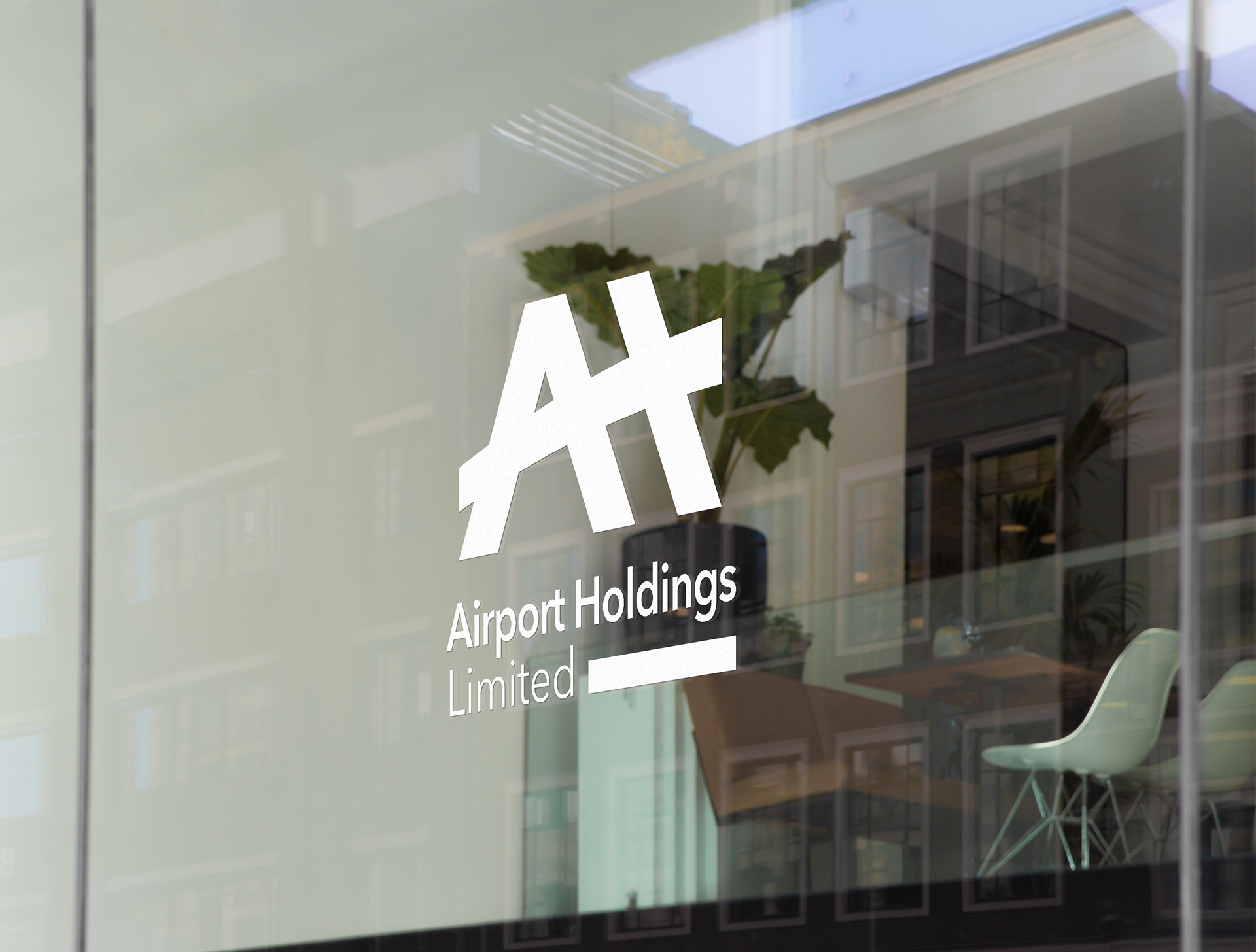
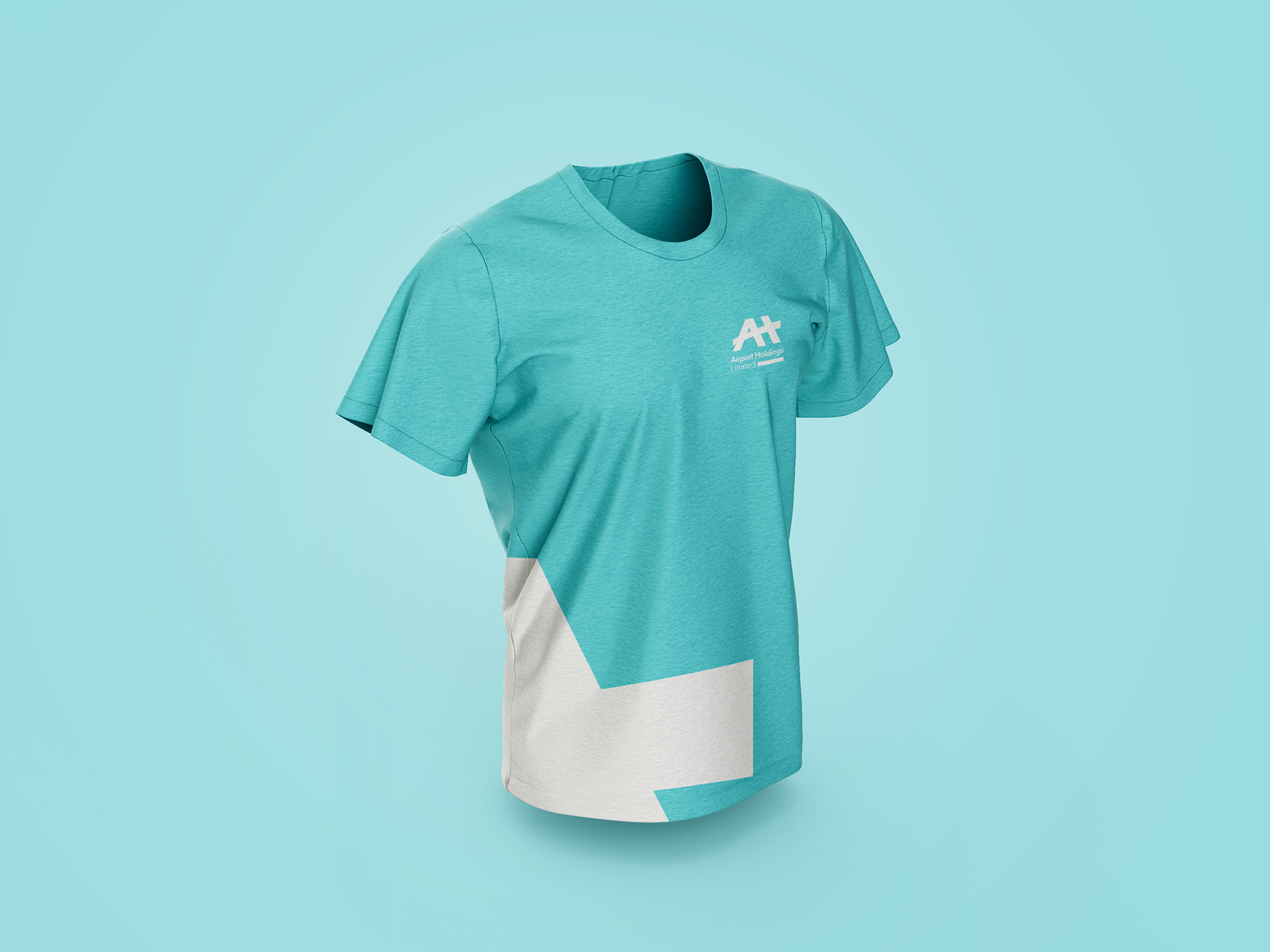
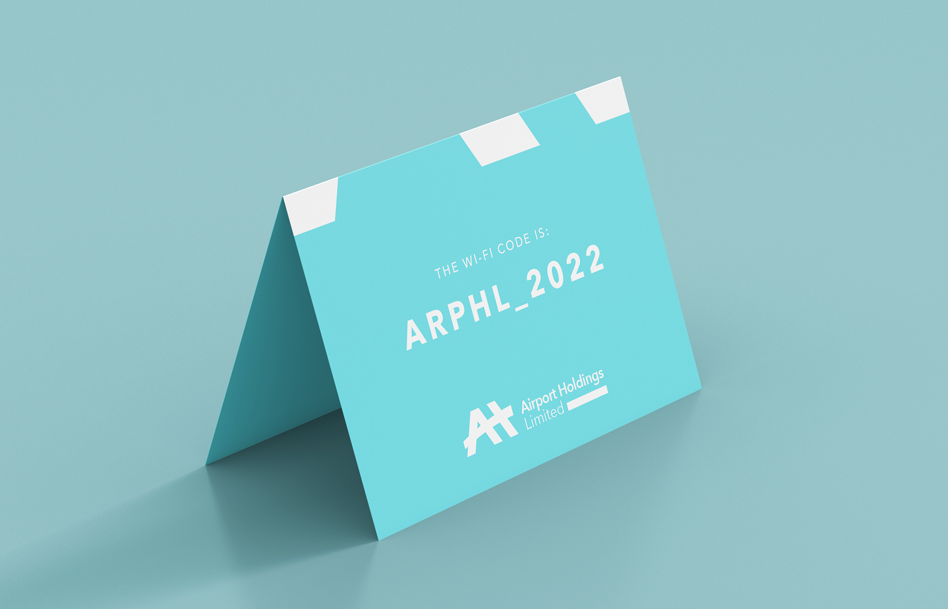
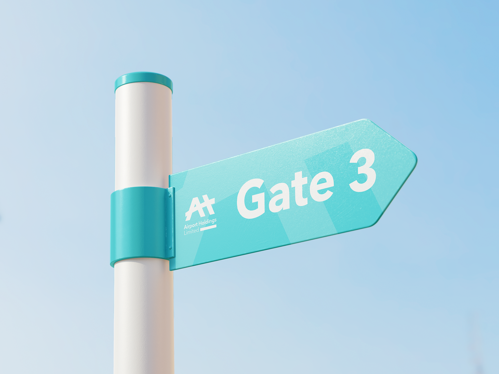
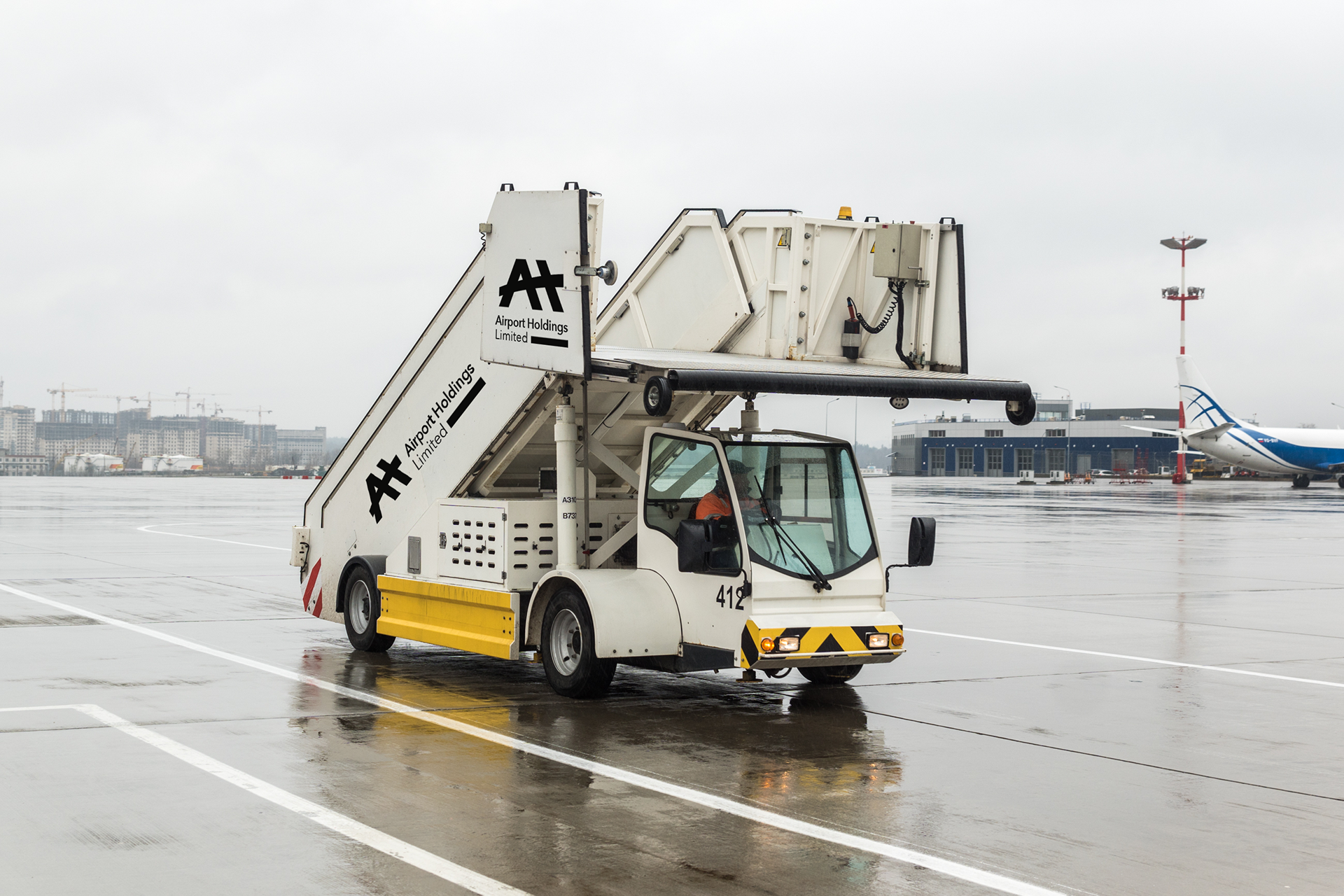
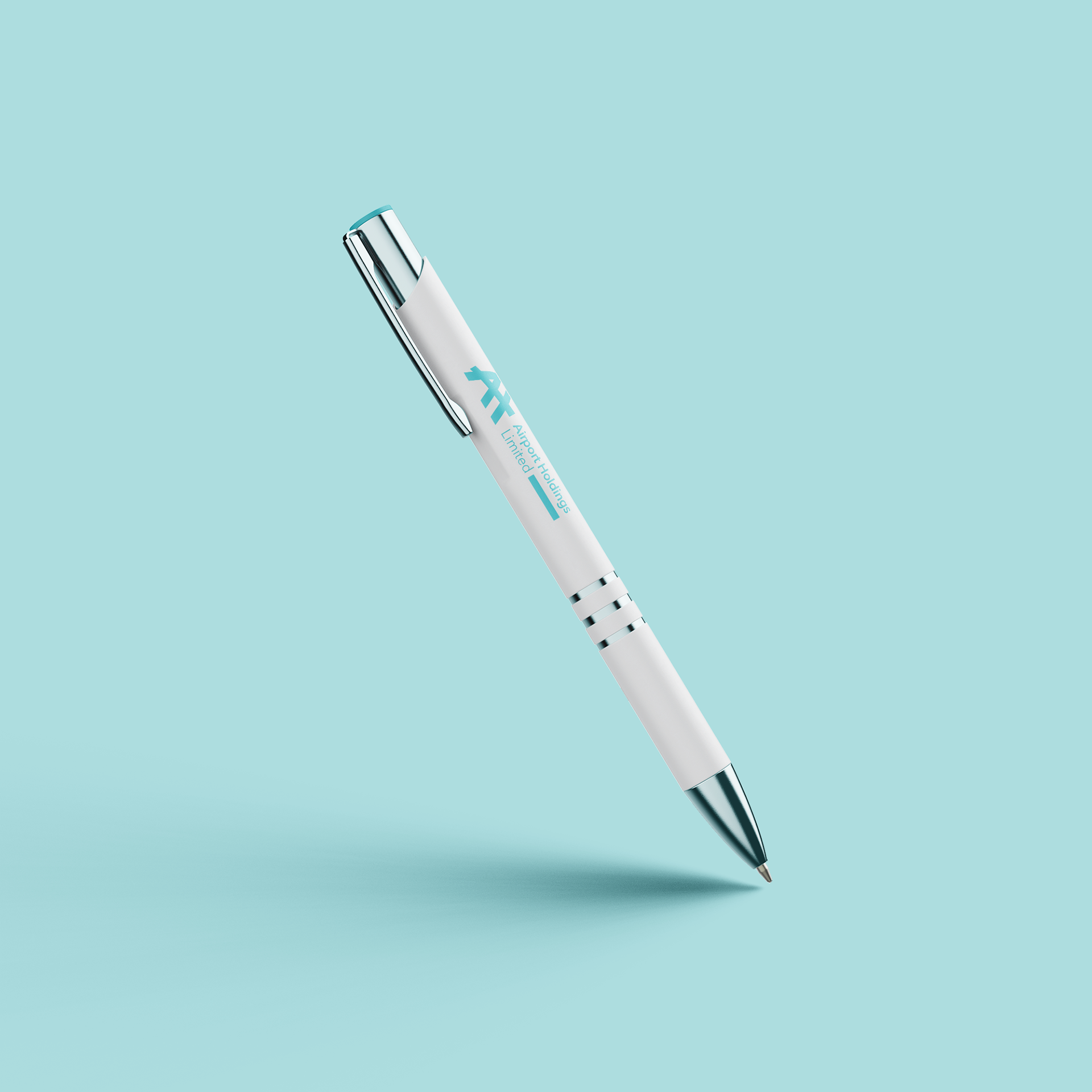
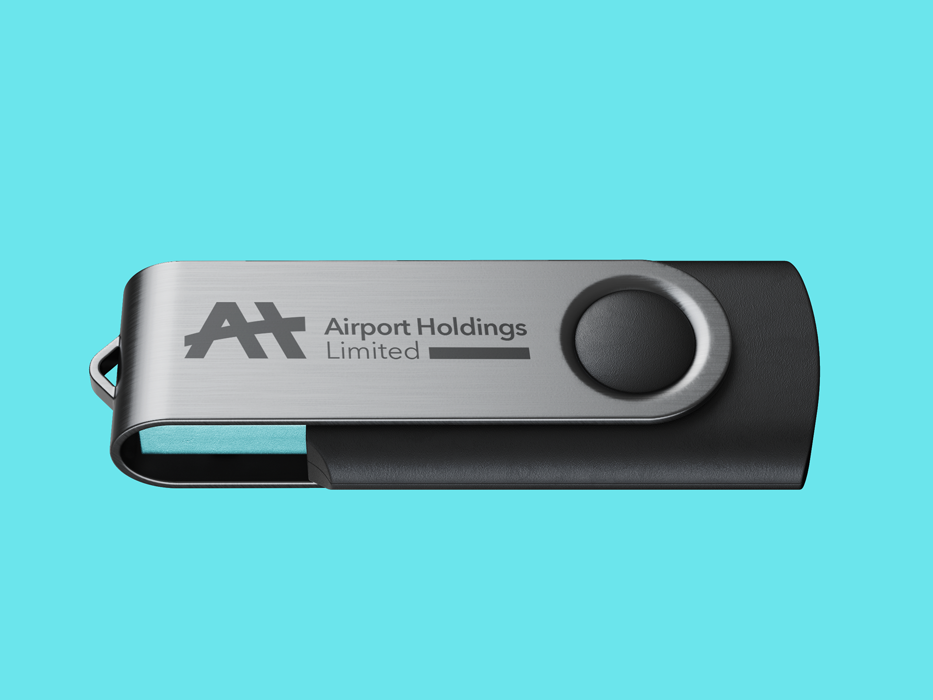
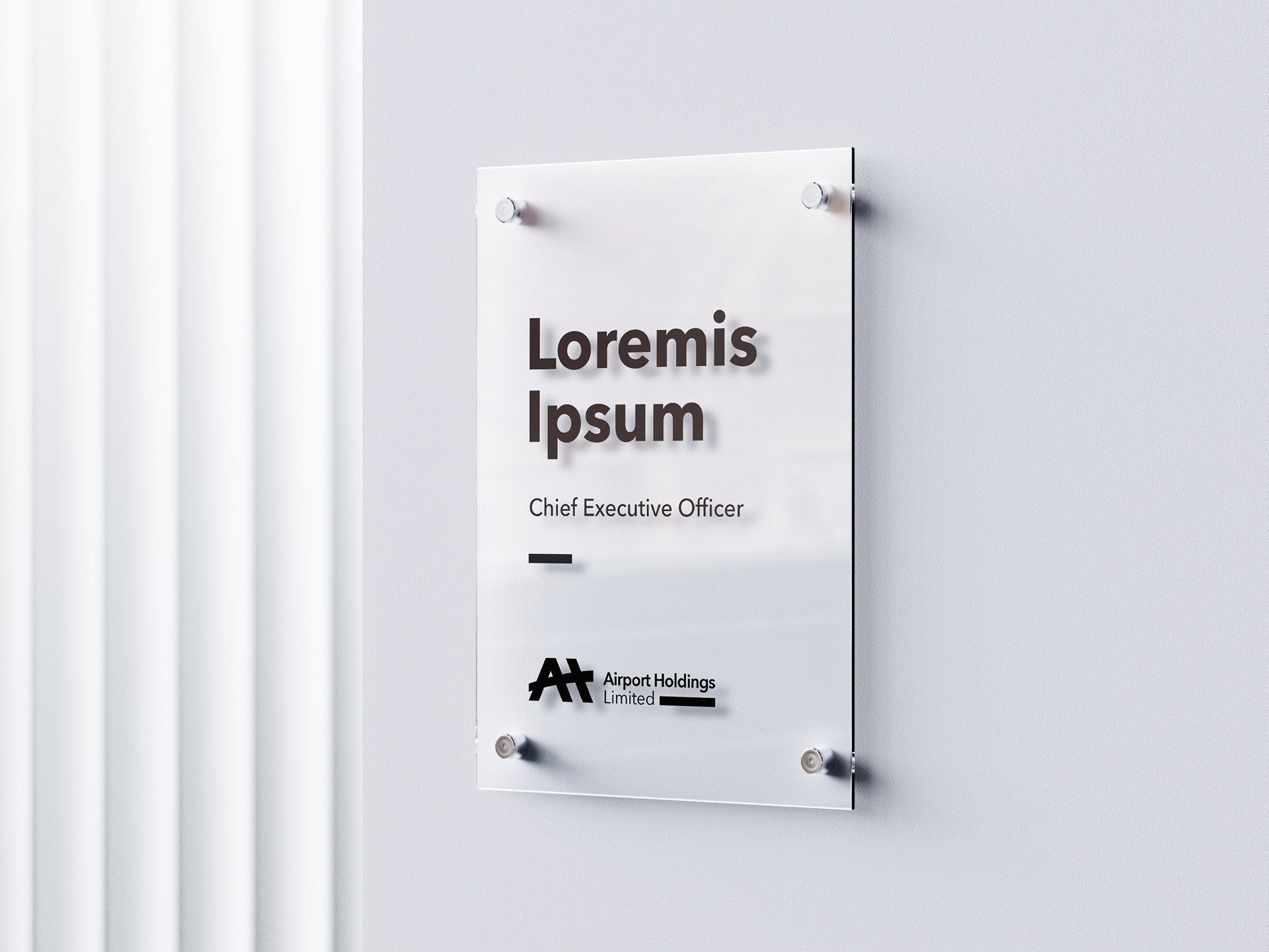
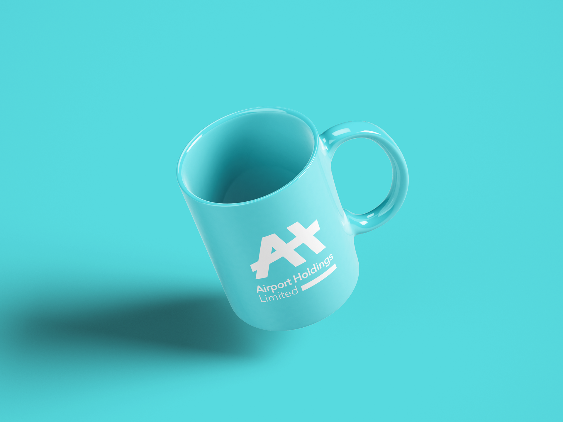
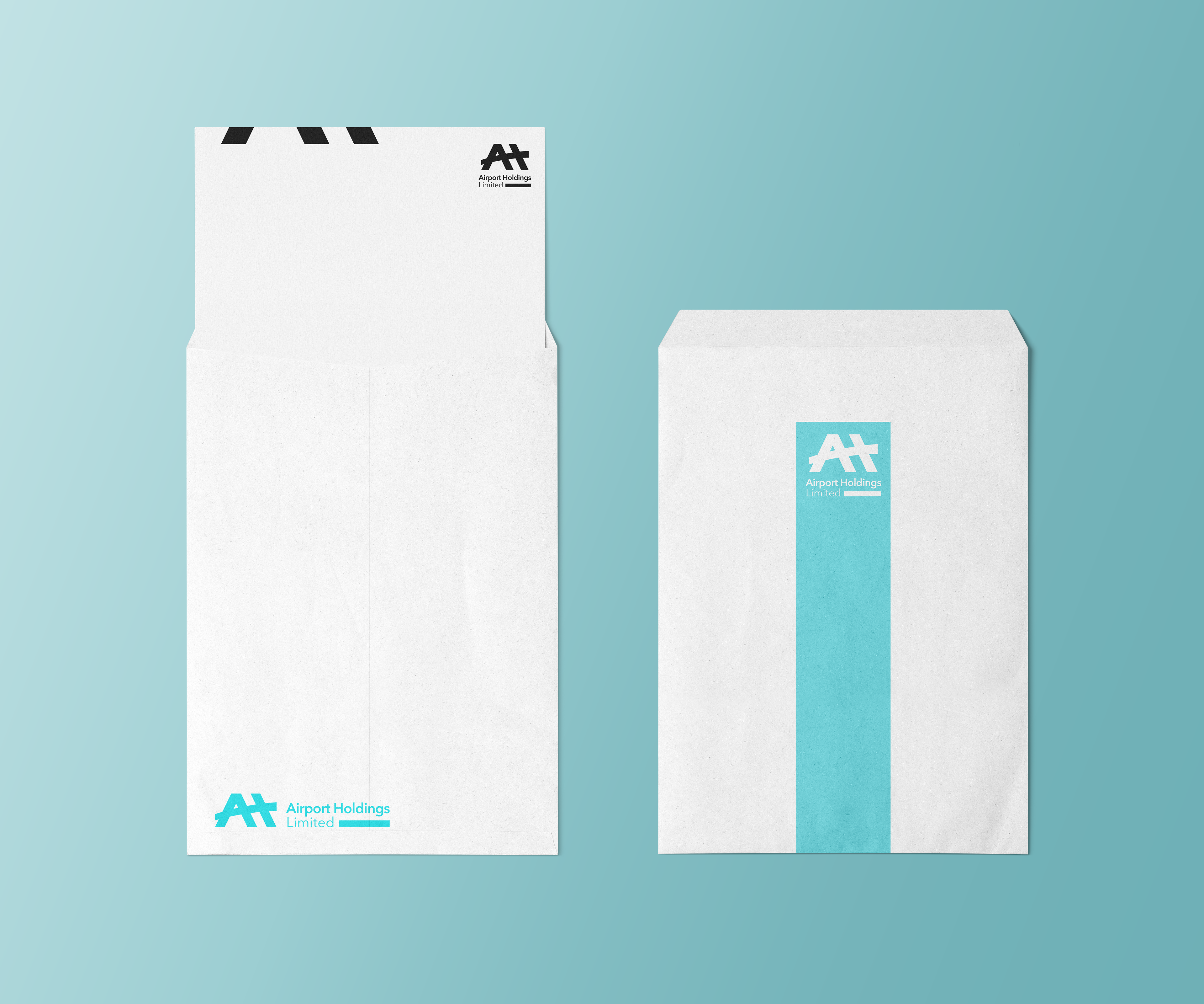
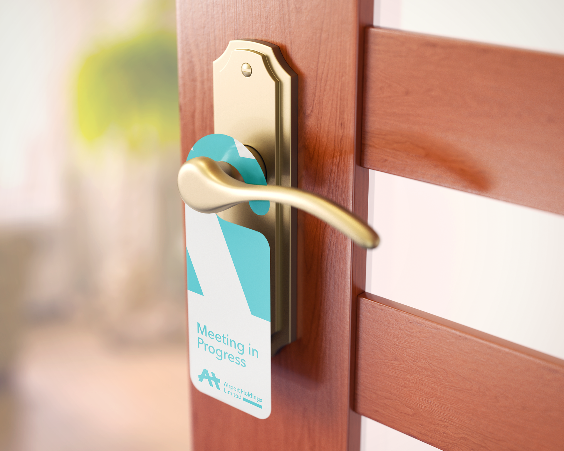
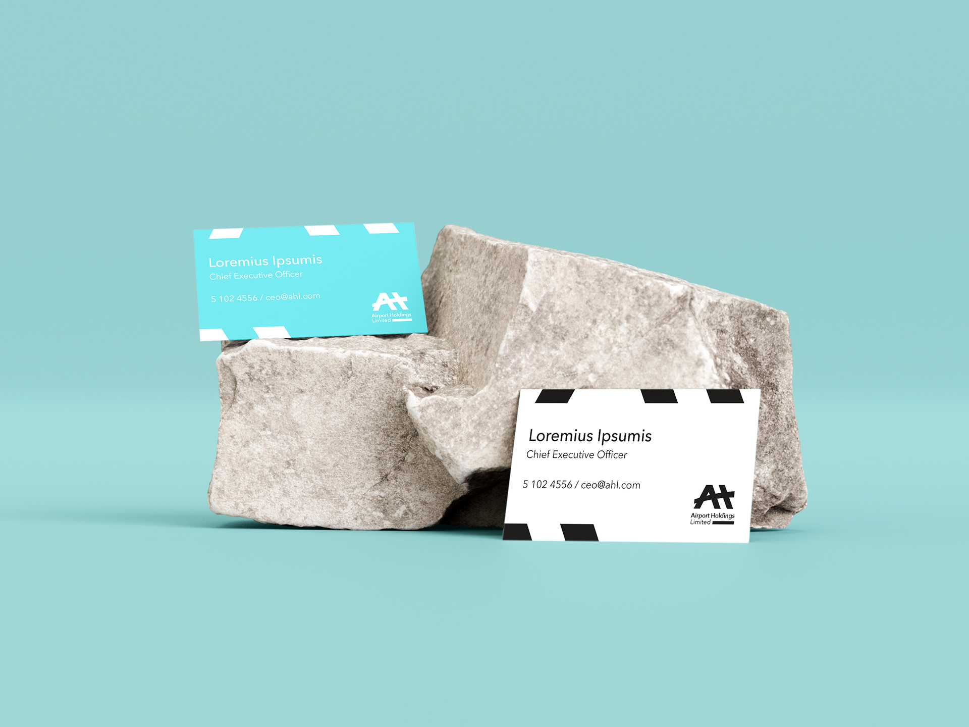
The second direction was more direct and industrial. It's a bold, stenciled monogram of the letters 'A' and 'H,' inspired by aviation architecture, runways, and structural trusses. This logo was designed to feel strong, stable, and deeply rooted in the tangible world of aviation and engineering.
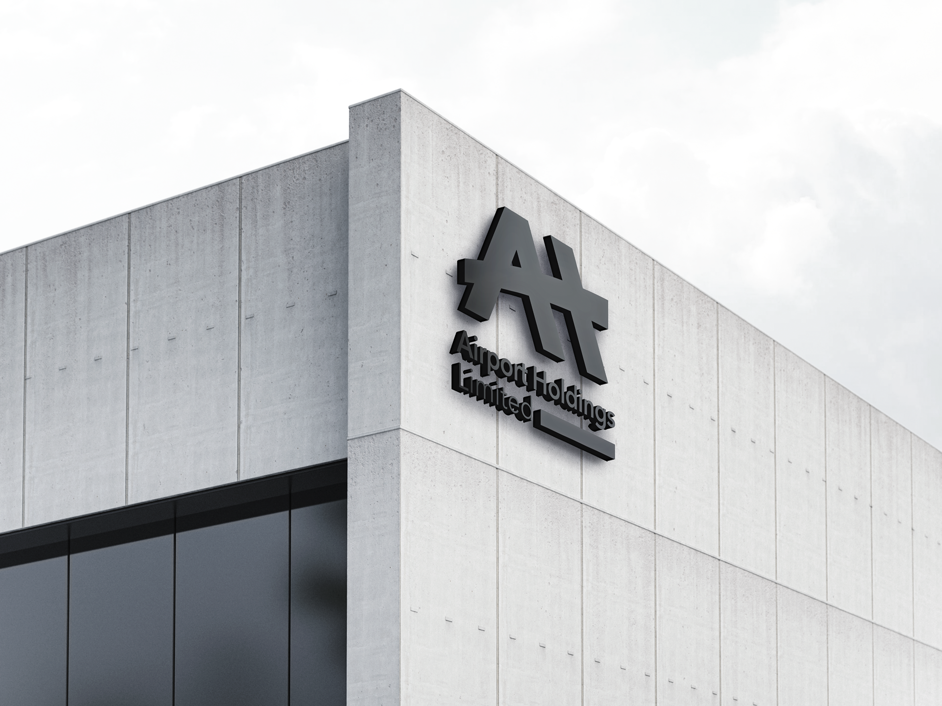
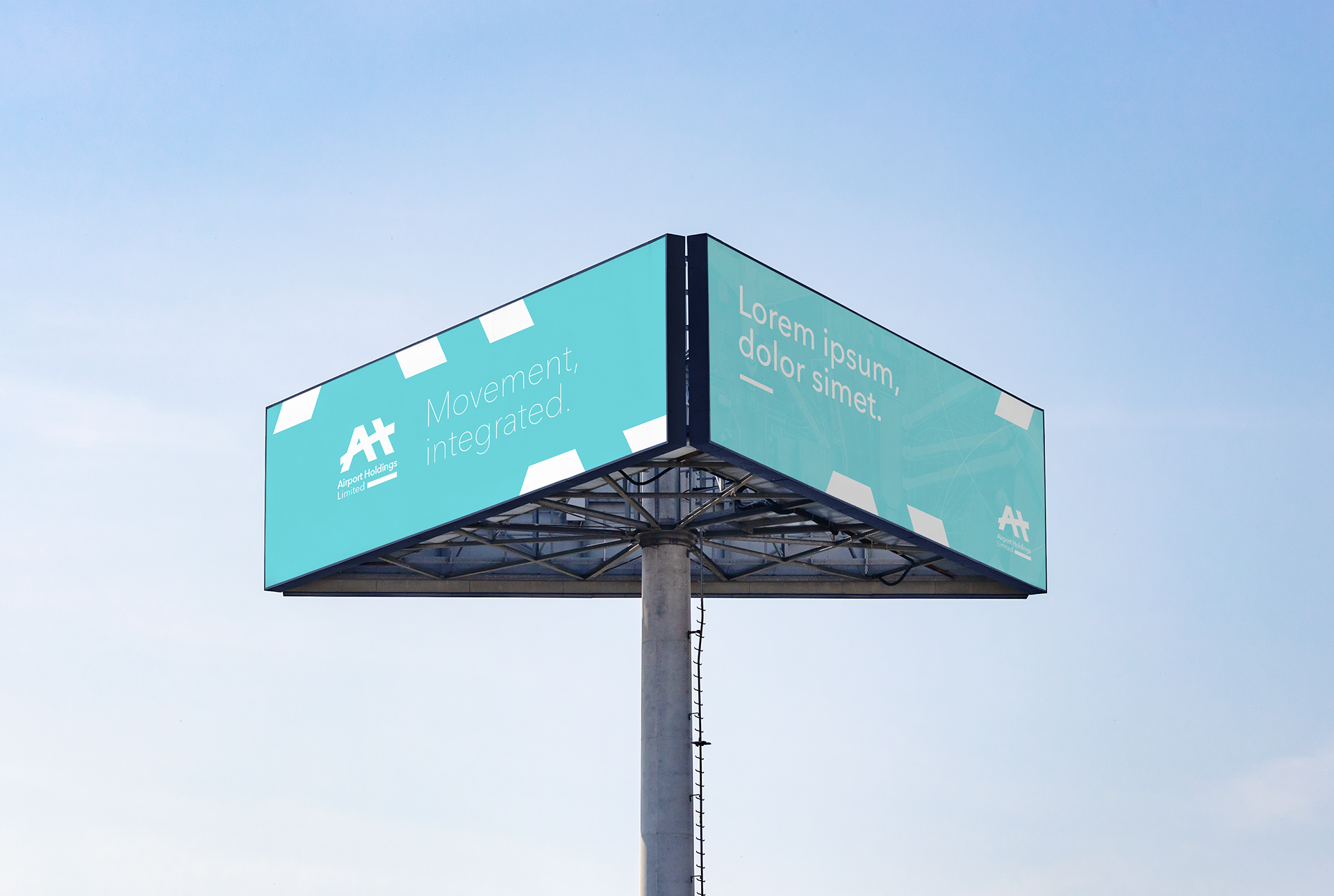
The Endorser Brand System.
A critical part of the proposal was showing how either logo would function as an "endorser brand." The poster mockups demonstrate how the AHL mark could be applied to advertisements for its subsidiaries, like Air Mauritius, acting as a quiet but confident seal of quality and ownership from the parent company.
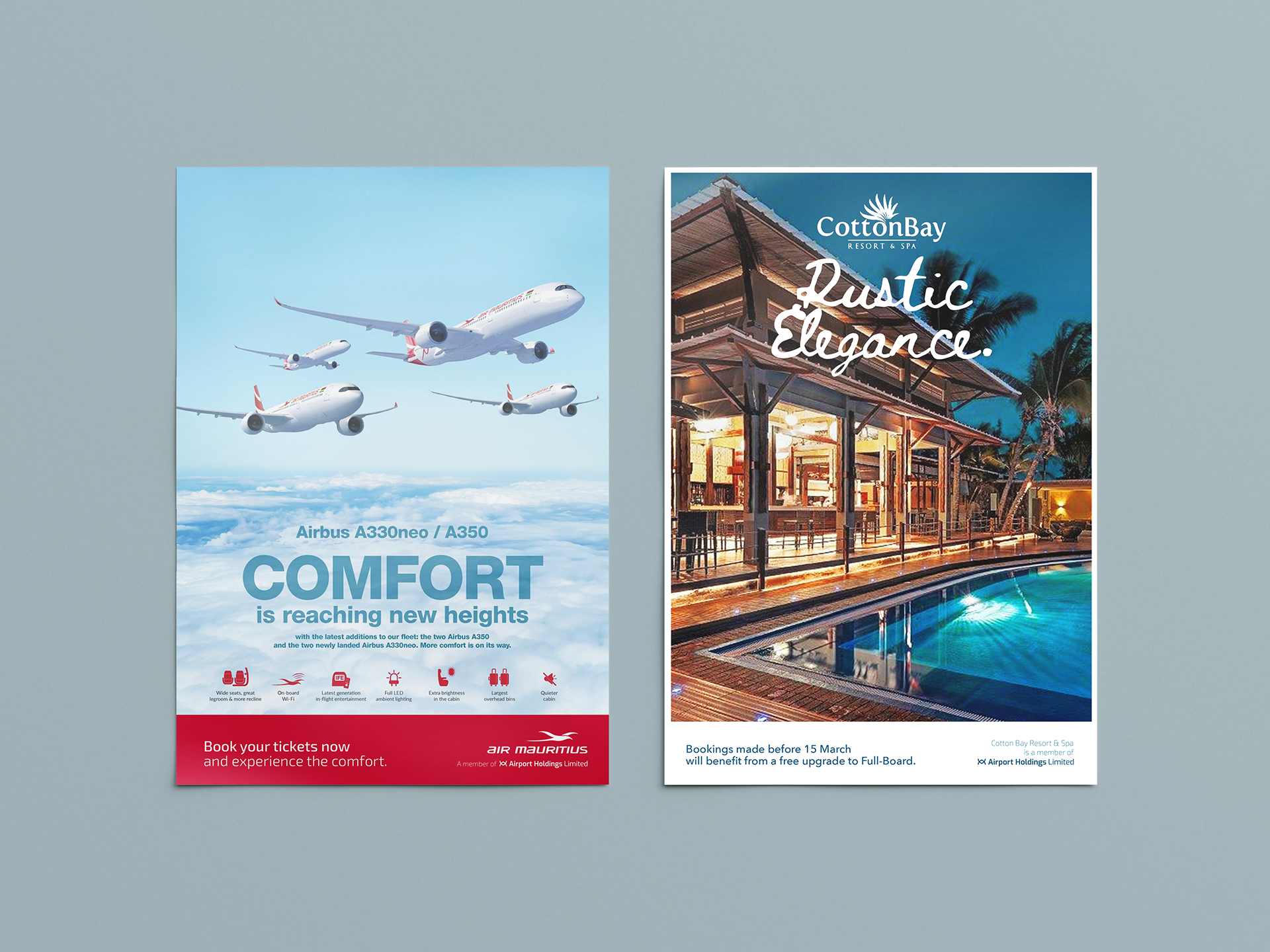
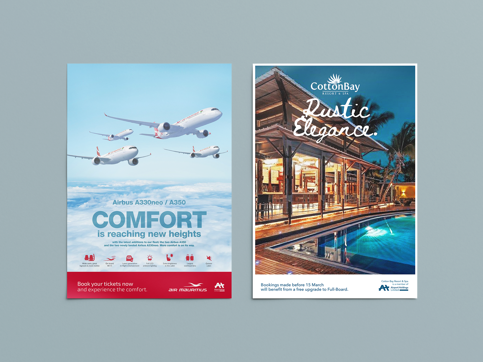
This project was a deep dive into high-level corporate identity. It was a fascinating exploration of how a single mark can define a holding company's entire philosophy—is the focus on seamless integration, or is it on foundational strength? It’s a great example of how logo design is truly a strategic business tool.