This was one of the first big projects I tackled when I joined Moris Pub Ogilvy, and it’s still one I’m incredibly proud of. It was a complete brand identity proposal for Croisières Australes, a major tour operator. The task was to redesign their logo and create a fresh visual world for them to live in.
The main creative objective was to capture the spirit of adventure and fun that Croisières Australes offers, while also conveying a sense of professionalism and premium quality. I wanted to give them options that felt modern, vibrant, and connected to the sea. Instead of just presenting a single idea, I developed three complete and distinct identity concepts, each with its own unique logo, color palette, and brand pattern.
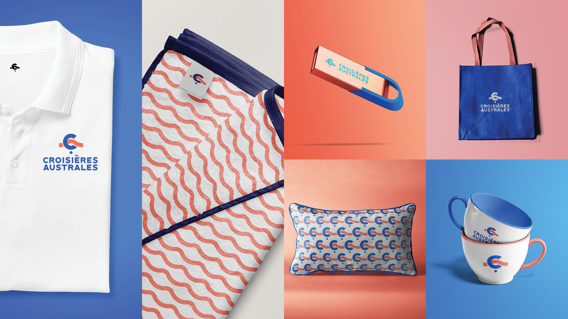
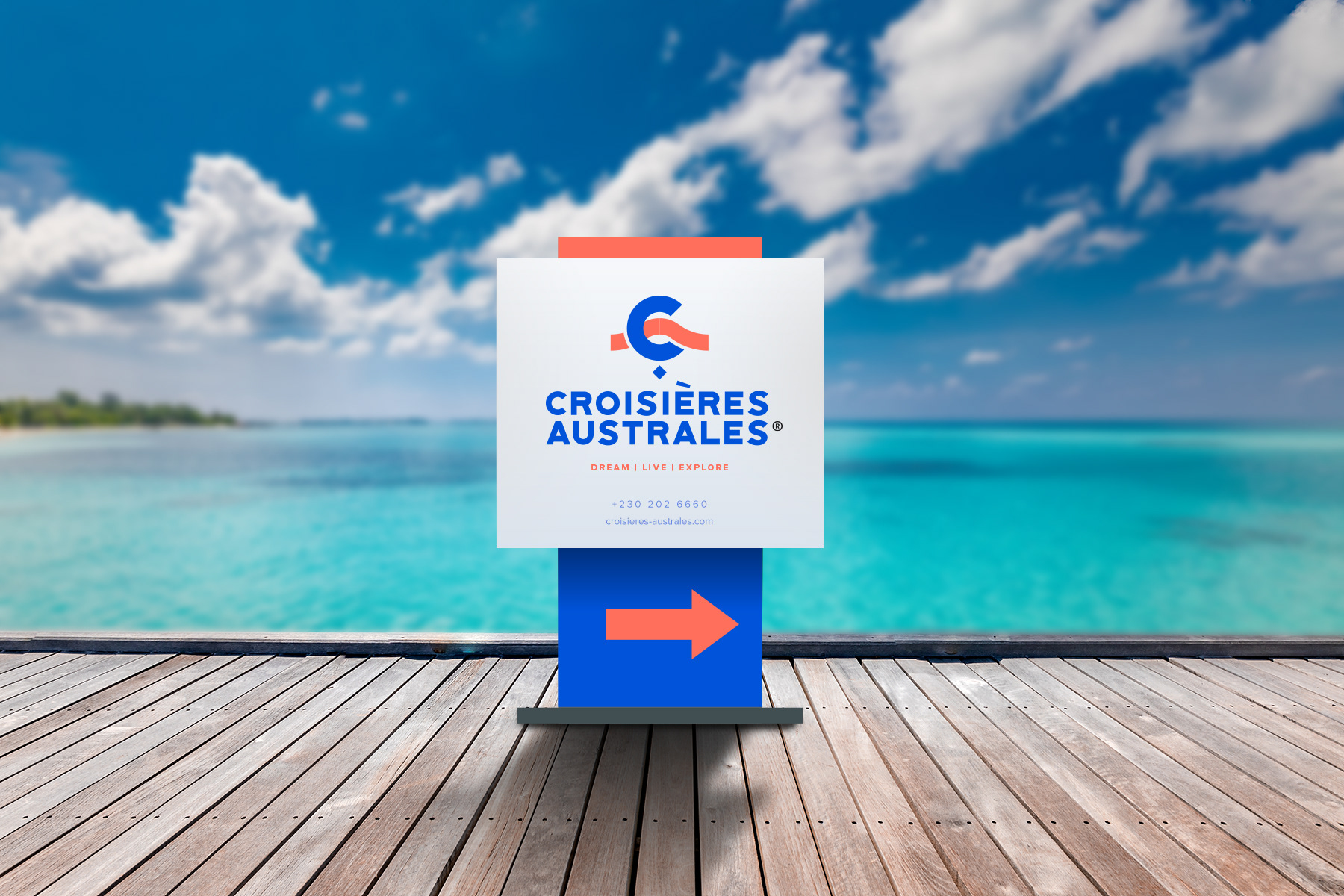
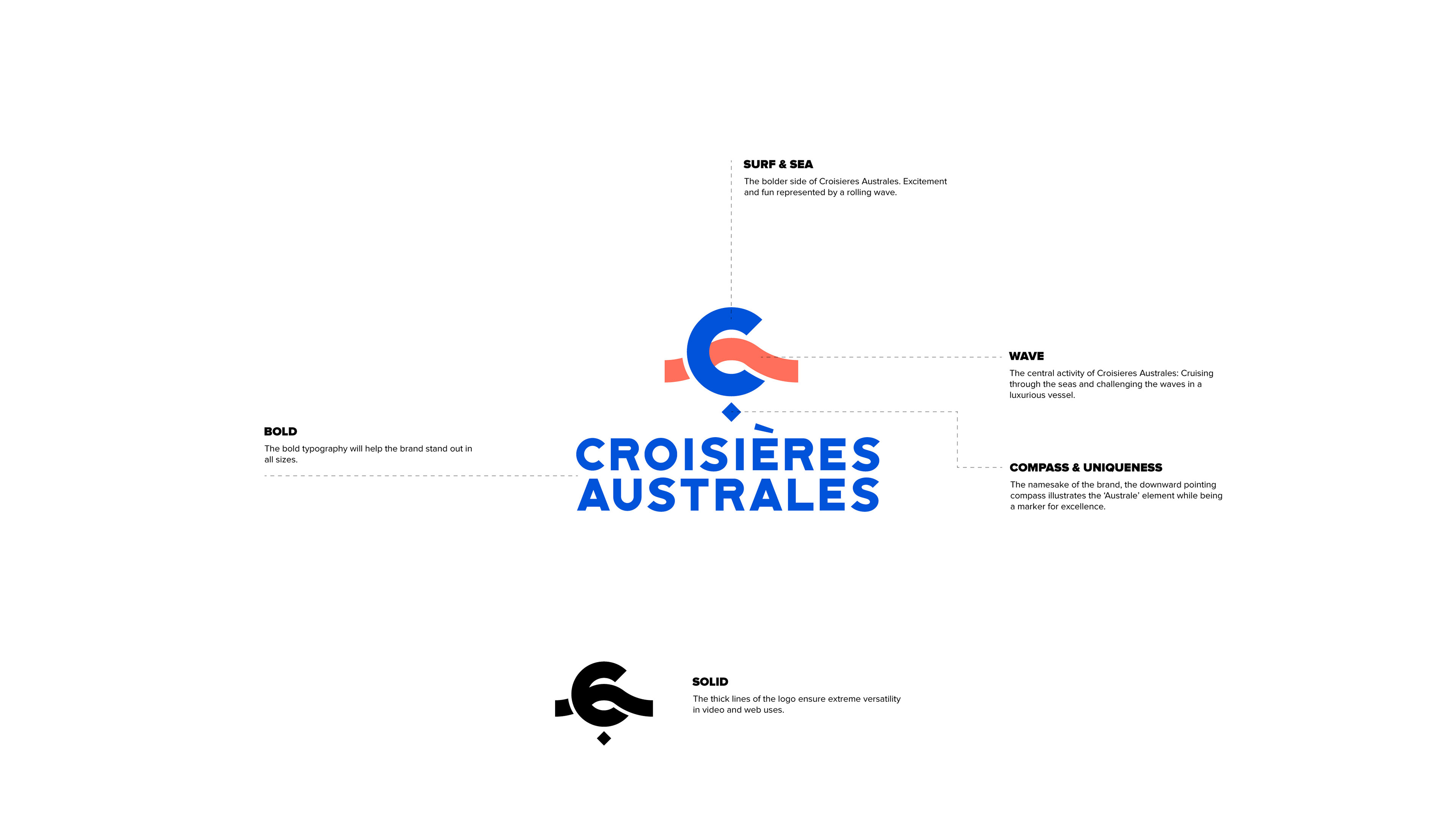
The Rolling Wave.
This concept was direct and energetic. The logo is a stylized "C" that also forms a powerful, rolling wave, representing the core activity of cruising through the seas. I paired this with a bold, solid typography to help the brand stand out and a dynamic, wavy brand pattern that could be used across different materials.
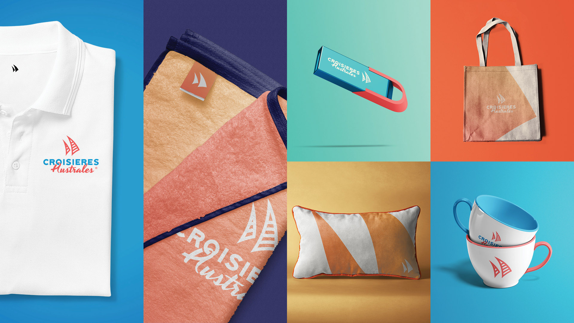
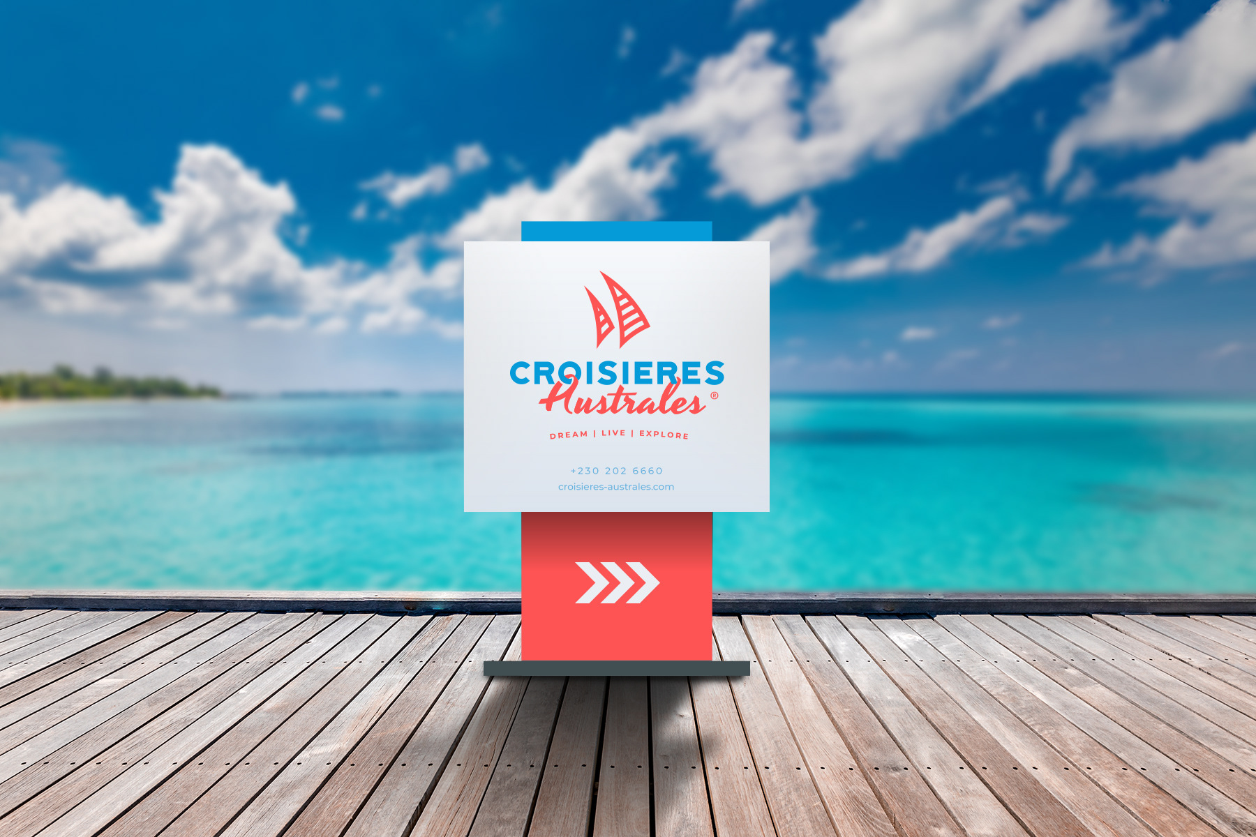
The Iconic Sail.
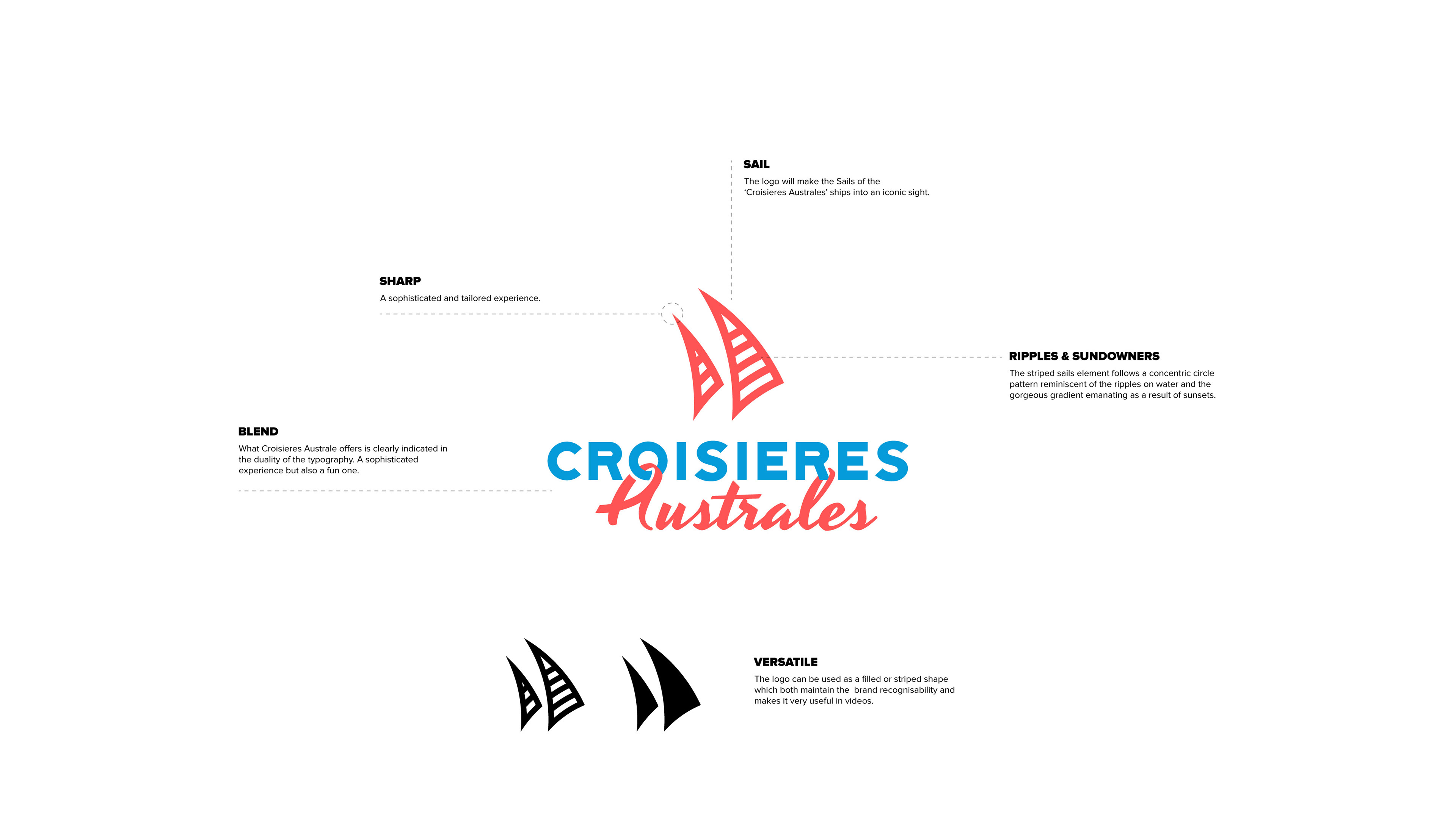
This was probably the most sophisticated and elegant of the three directions. The logo represents the iconic sails of the catamarans, with a striped pattern that mimics ripples on the water. The whole feeling was meant to be sharp, tailored, and clearly communicate a blend of fun and sophistication.
The Star Compass.
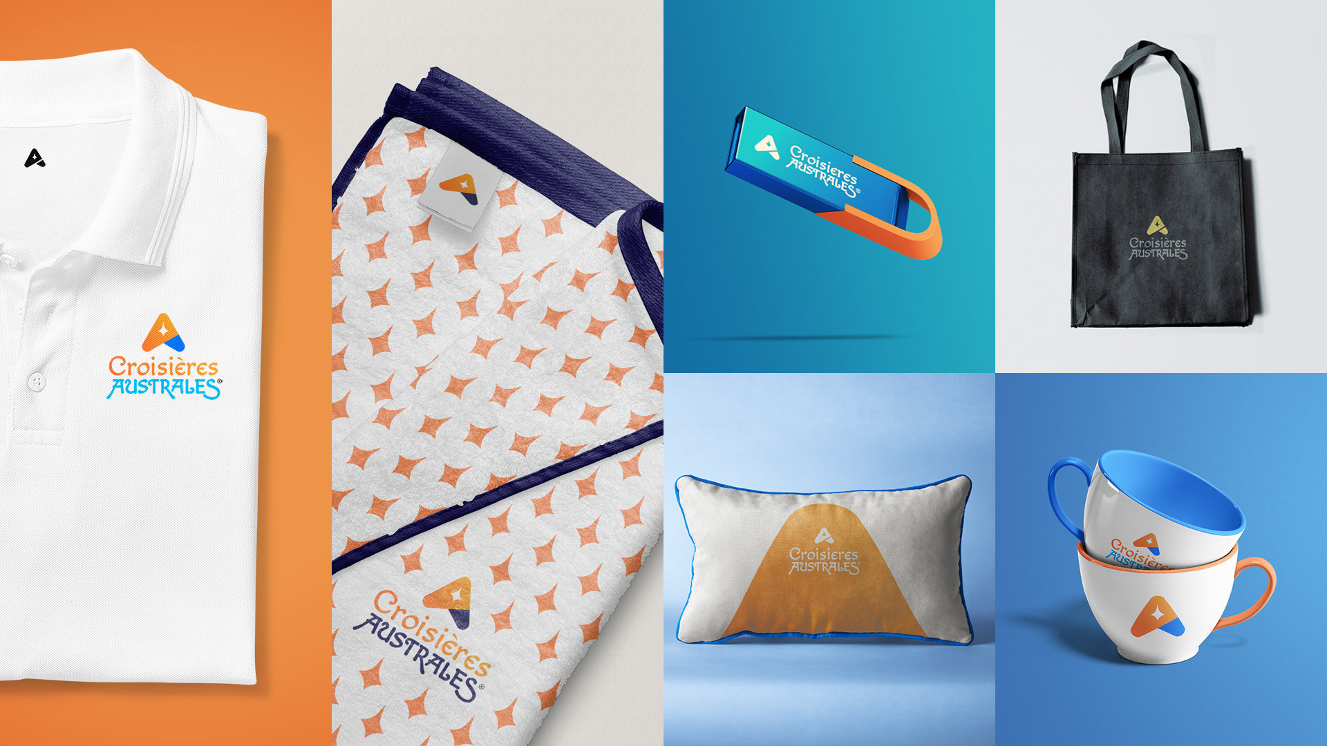
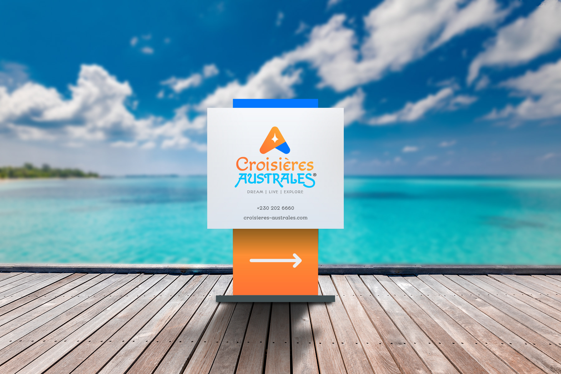
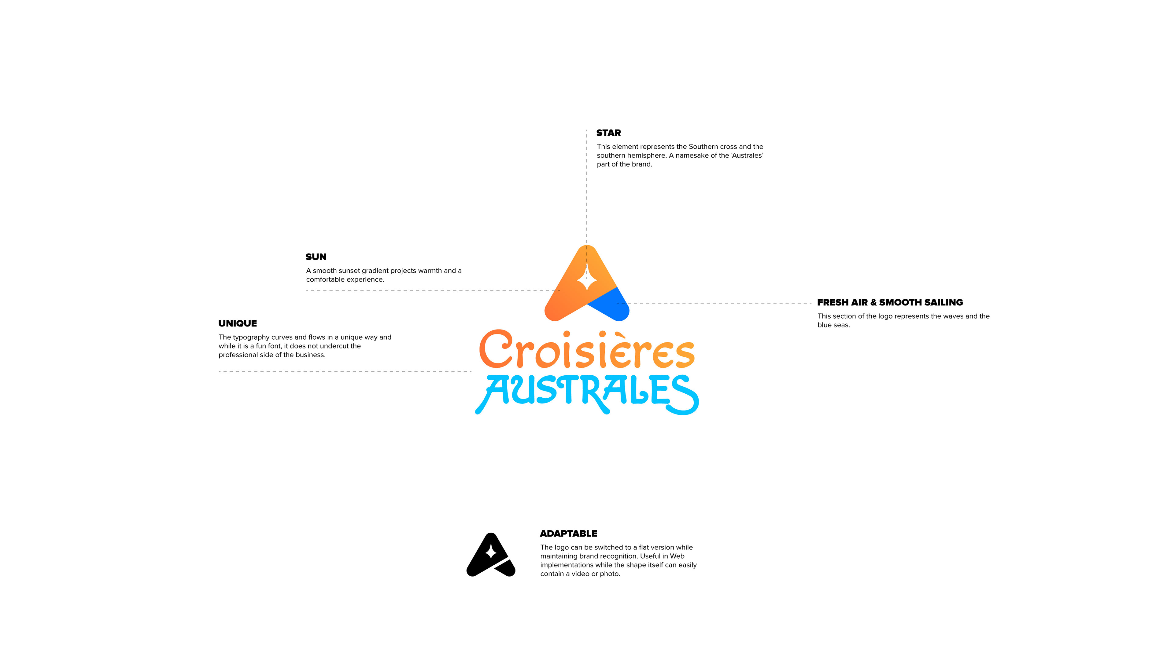
This option was an exploration of a concept thought of by the Creative Director, Kevin Bansee. This direction was built around a stylized "A" that doubles as a star and a compass point. The idea was to evoke the Southern Cross and the feeling of navigation and exploration. The warm, sunset gradient in the logo was designed to feel comfortable and inviting, while the fun, flowing typography kept it from feeling too corporate.
Even though the client ultimately went with a different solution, this project will always be a favorite of mine. It was a fantastic opportunity to really dive deep into a single brand and explore all the different ways its story could be told visually. It taught me a lot about building complete, cohesive brand systems, and I'm really proud of the unique personality we created for each of these three concepts.