For a rebrand as significant as Medine Distillery's, the journey is just as important as the destination. Before we developed the final concept, I went through a deep exploration to discover the different personalities the brand could inhabit and the different stories it could tell.
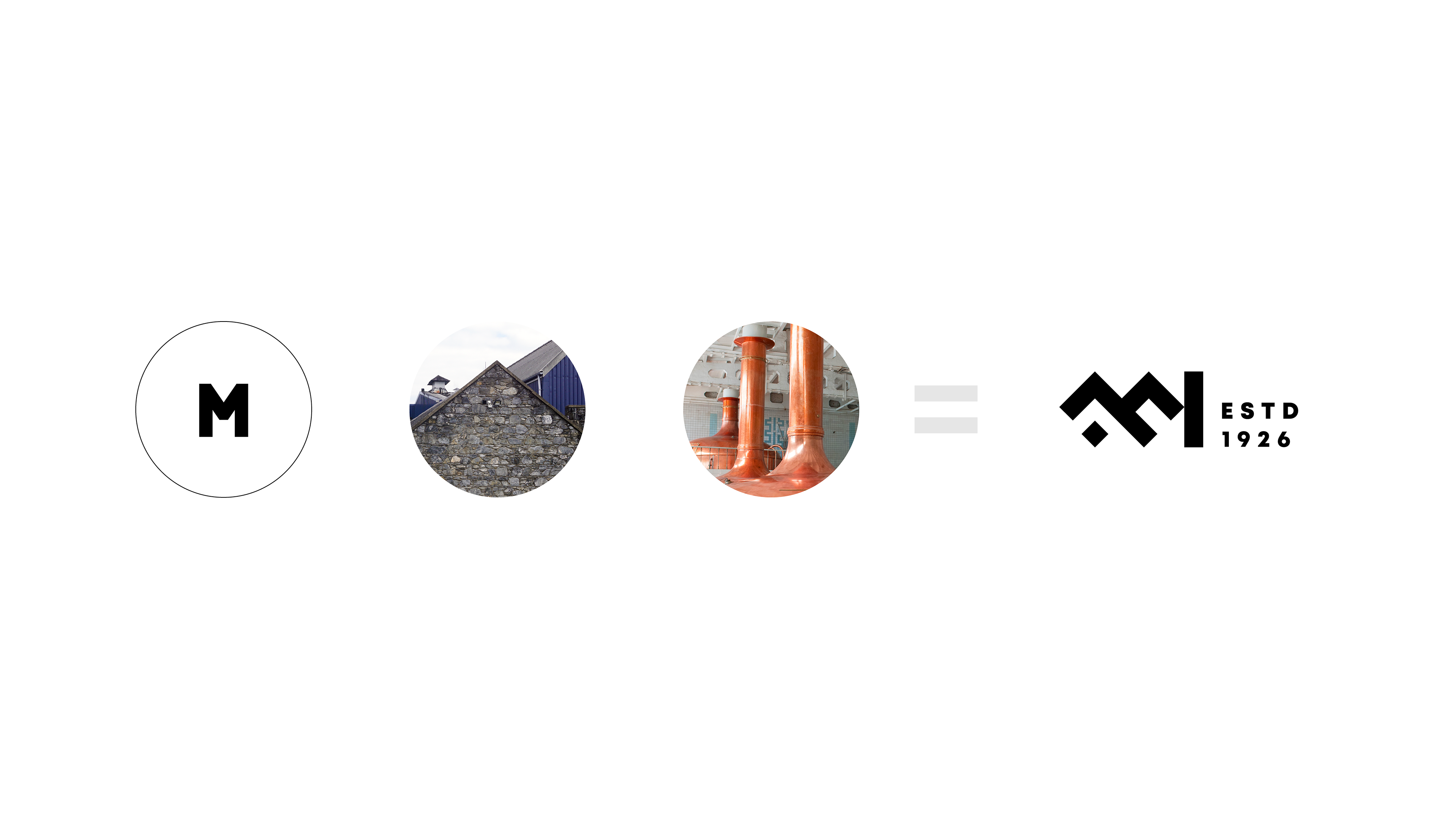
The strategic goal was to move Medine Distillery away from its generic barrel logo and find a new identity rooted in a more authentic story. To do this, I developed several distinct creative territories, each with a unique logo system, to give the client a real choice between different strategic positionings. This was about testing the brand's potential—from modern and friendly to traditional and industrial.
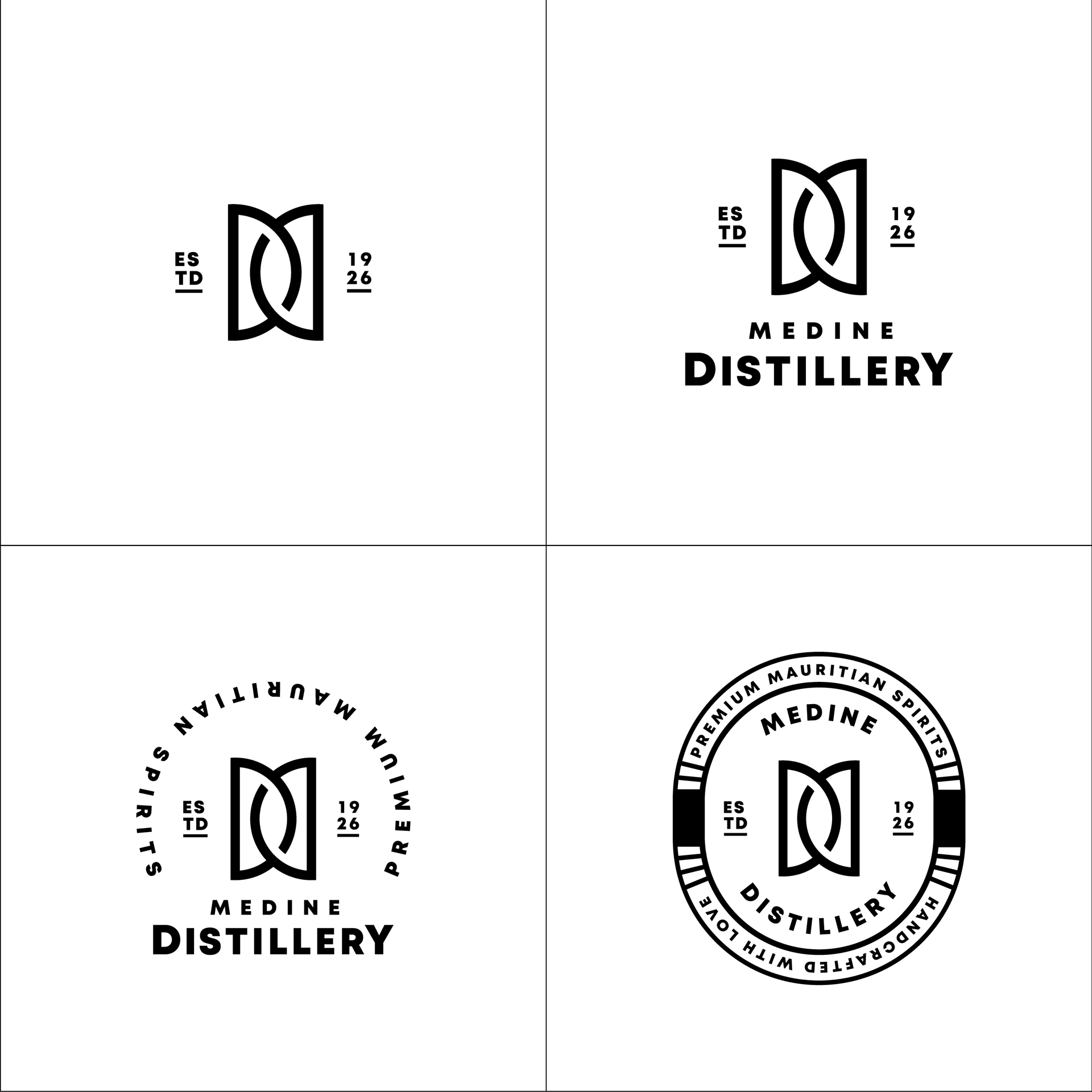
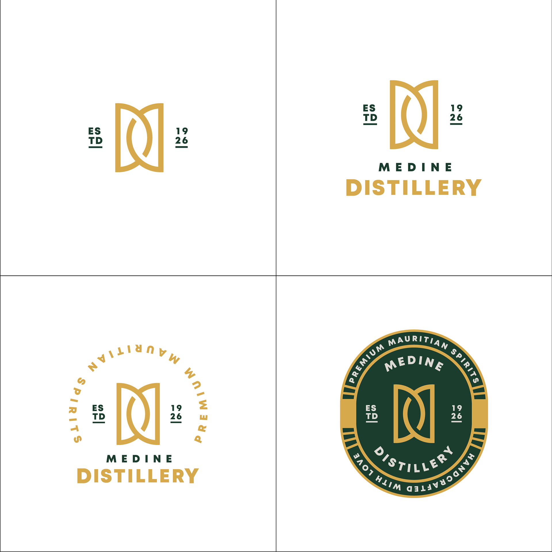
The Elegant Still.
This direction was built around a graceful, continuous-line "MD" monogram. The shape was designed to subtly evoke classic copper pot still pipes and barrels, creating a feeling of pure sophistication and focusing on the fine craft of distillation.
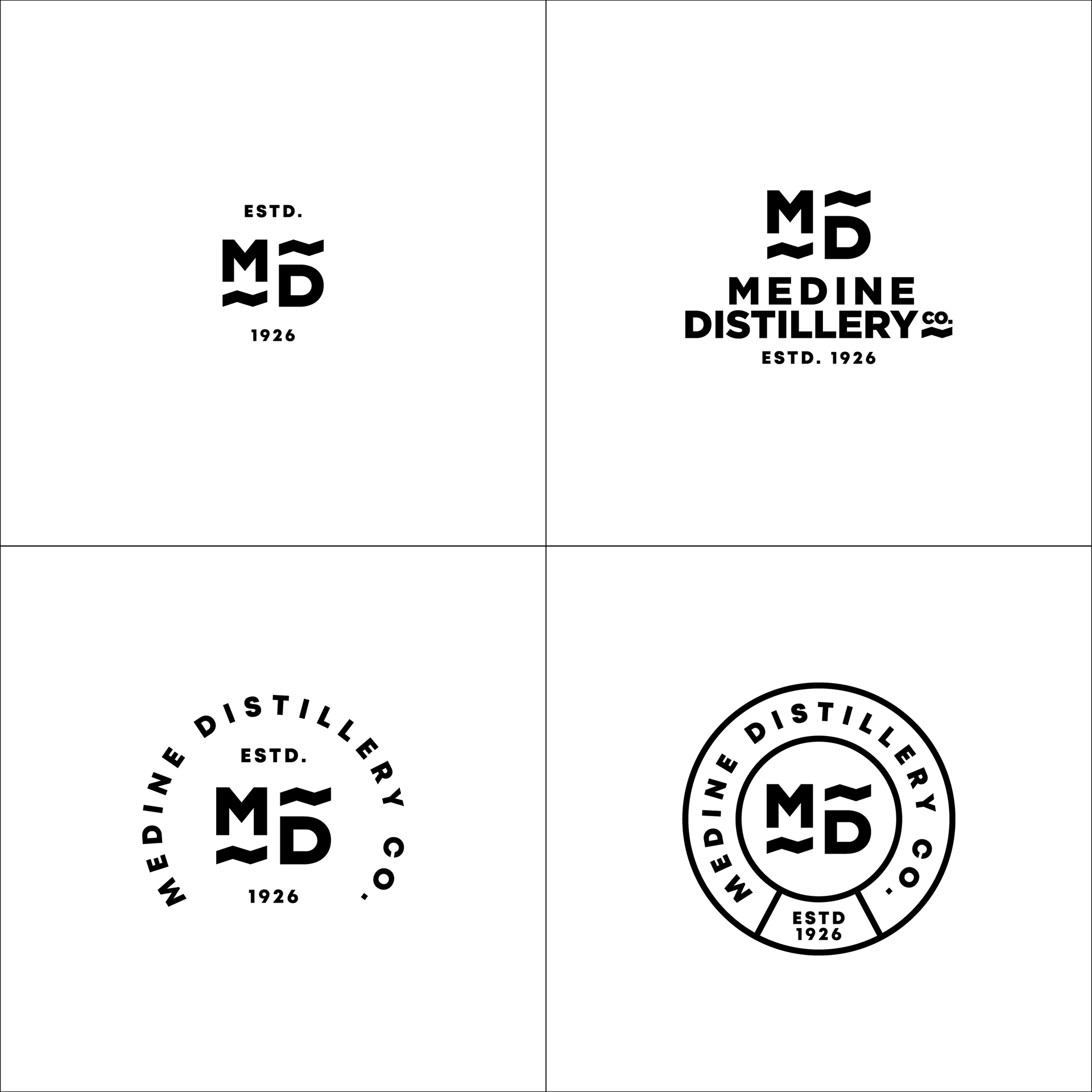
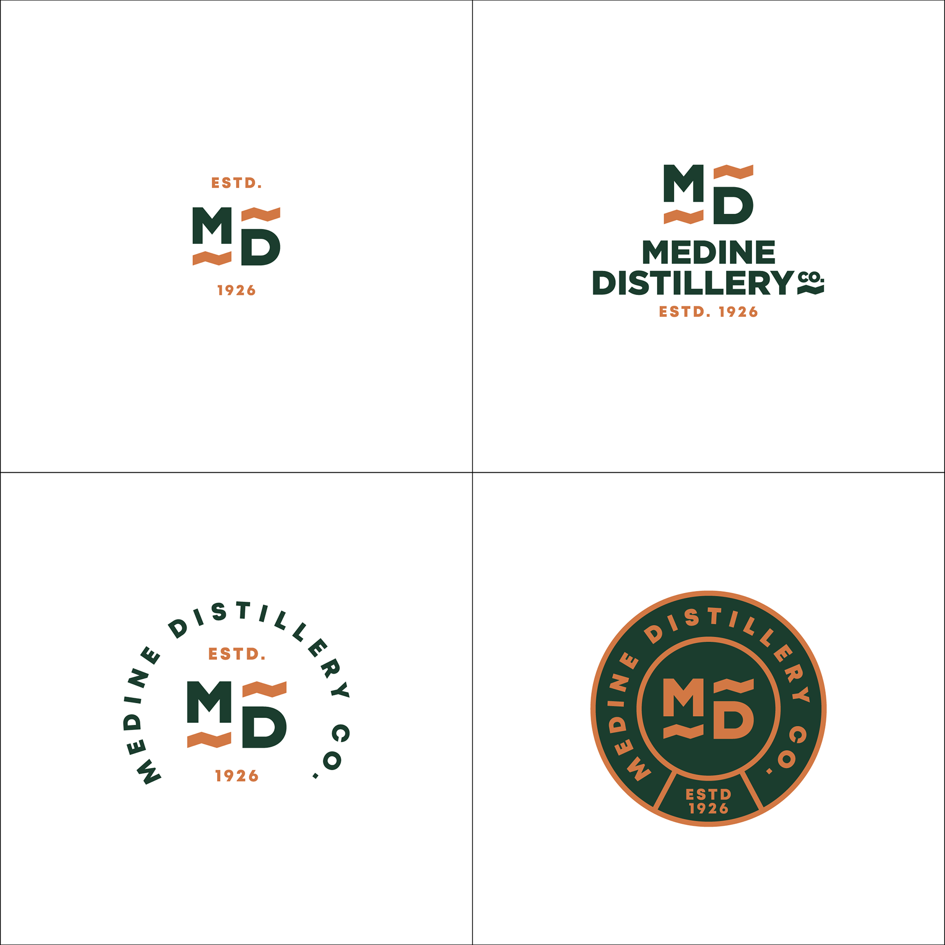
The Modern Wave.
This concept was more contemporary and approachable. It uses a bold, blocky "MD" monogram accented with a simple, friendly wave. This element was meant to hint at either the liquid itself or the warm, breezy island environment, giving the brand a more relaxed and modern personality.
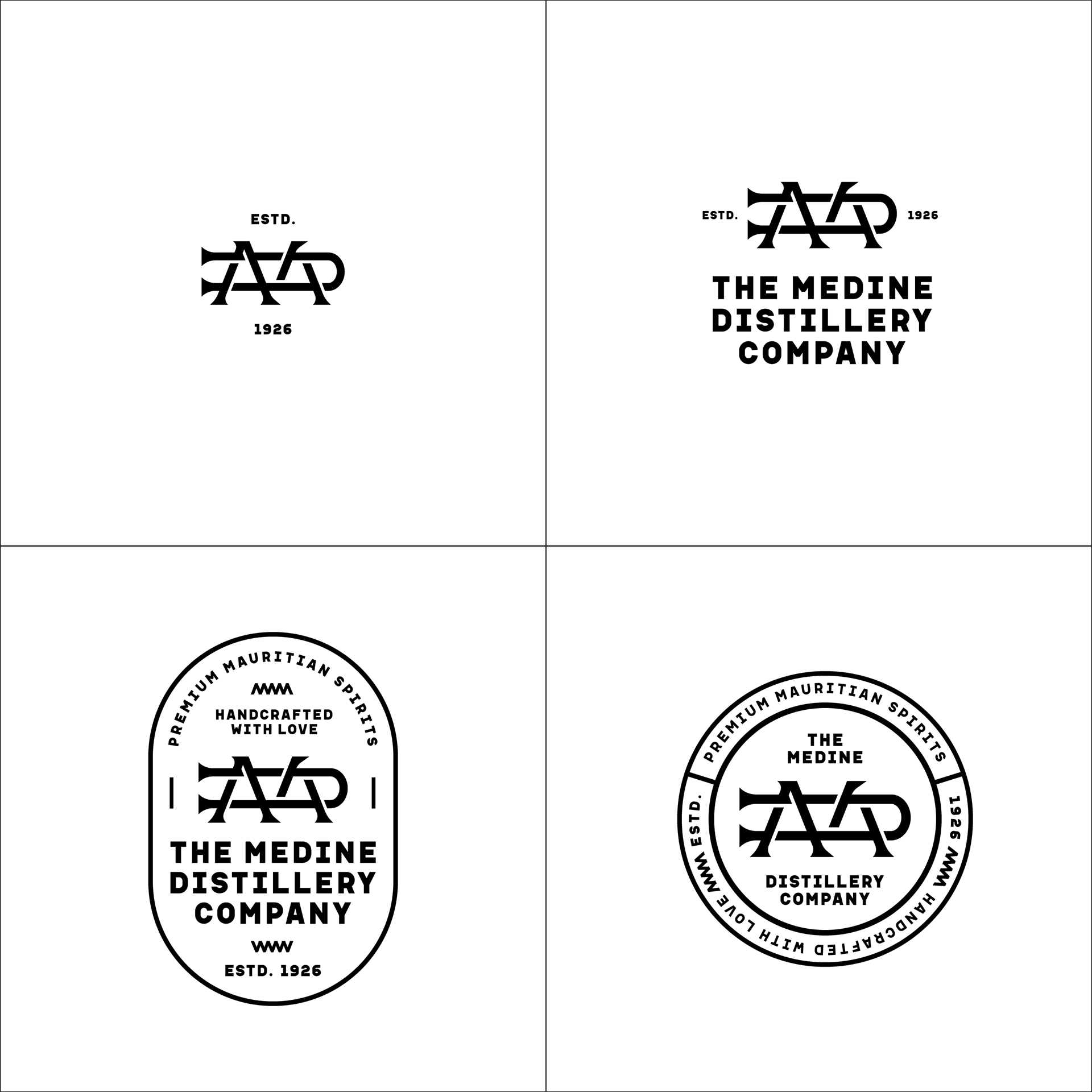
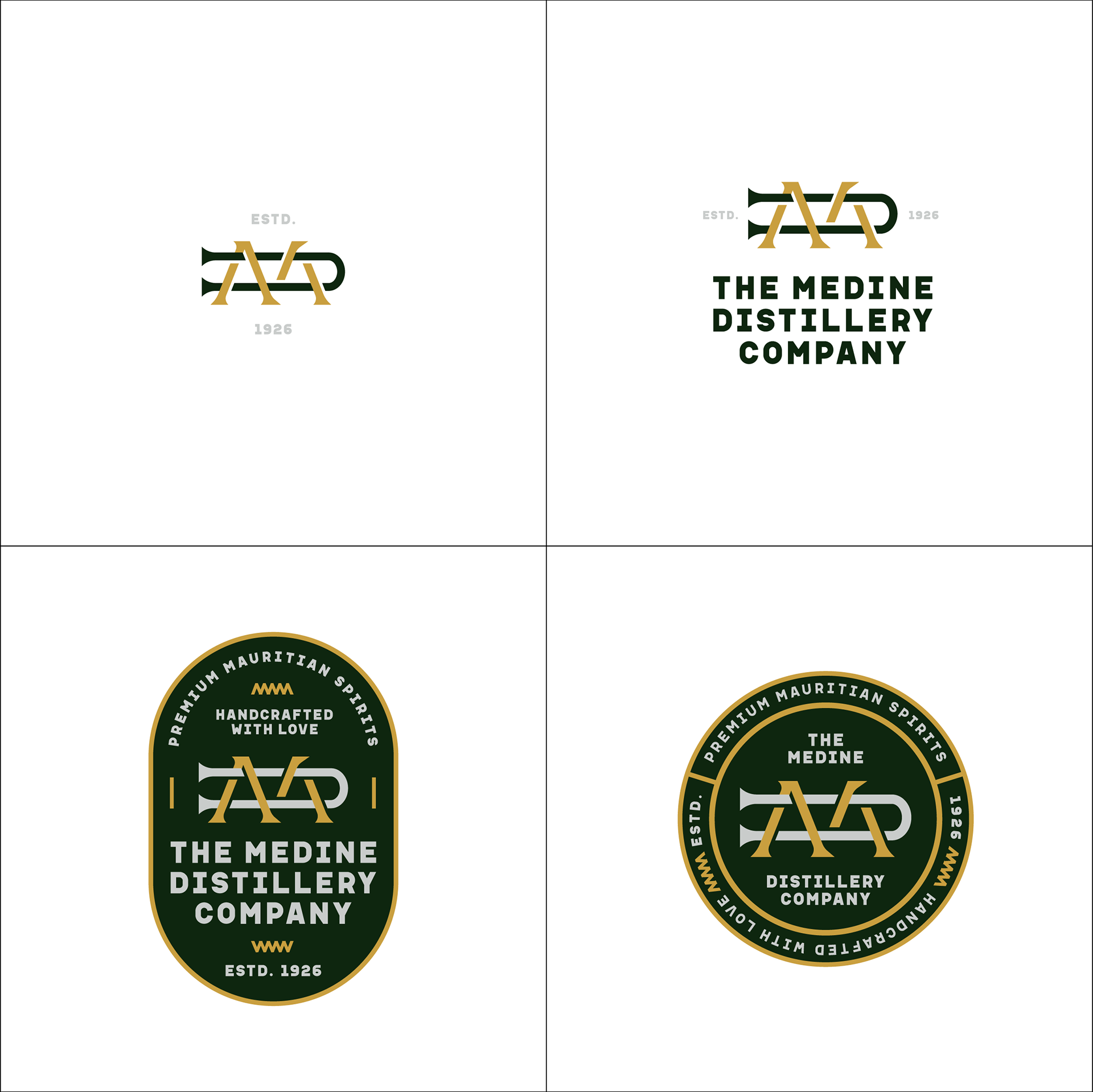
The Artisanal Mark.
Leaning into a more rustic, handcrafted feel, this option used an abstract, almost runic symbol created from the brand's initials. The goal here was to create a mark that felt timeless, strong, and deeply connected to artisanal tradition, as if it were a maker's mark stamped by hand.
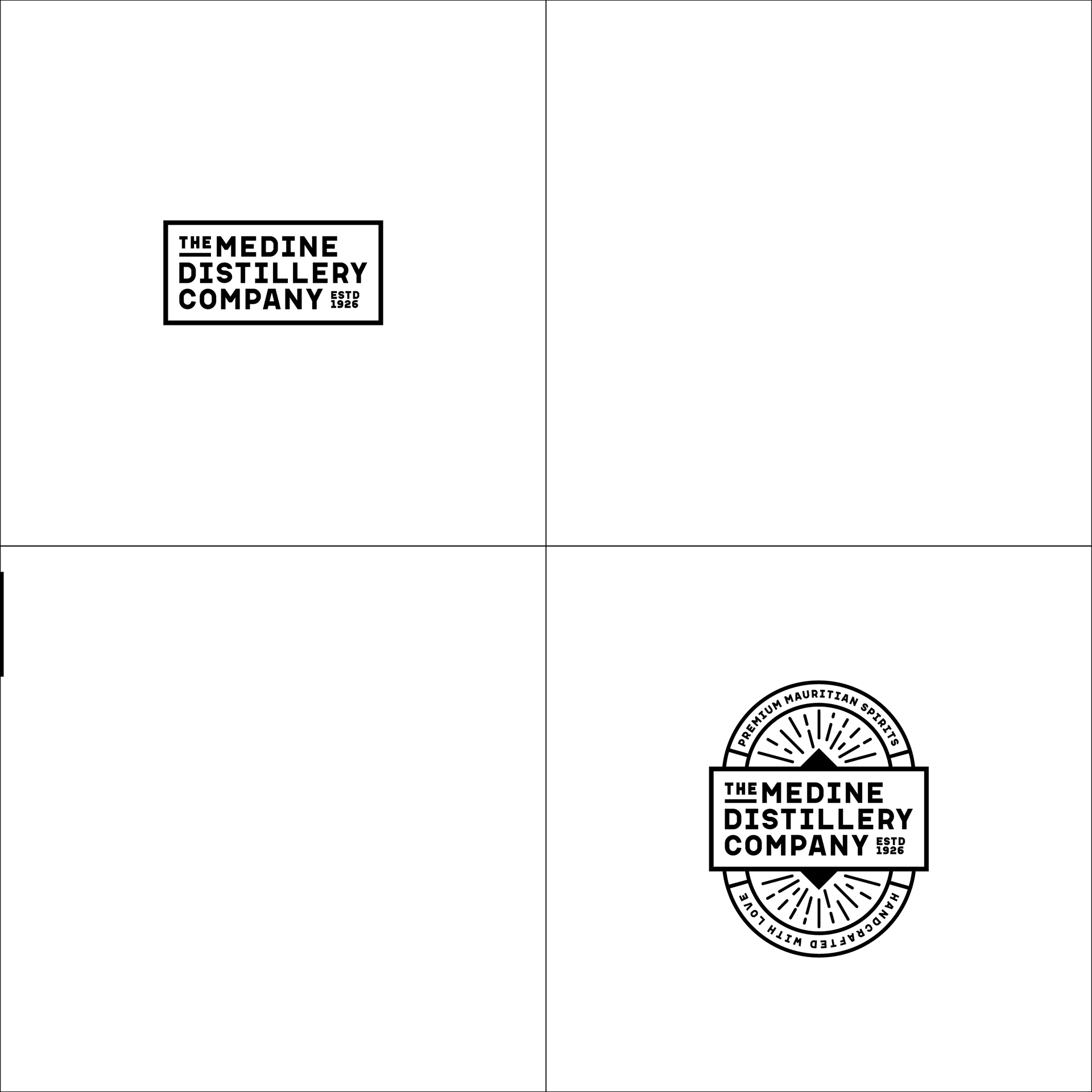
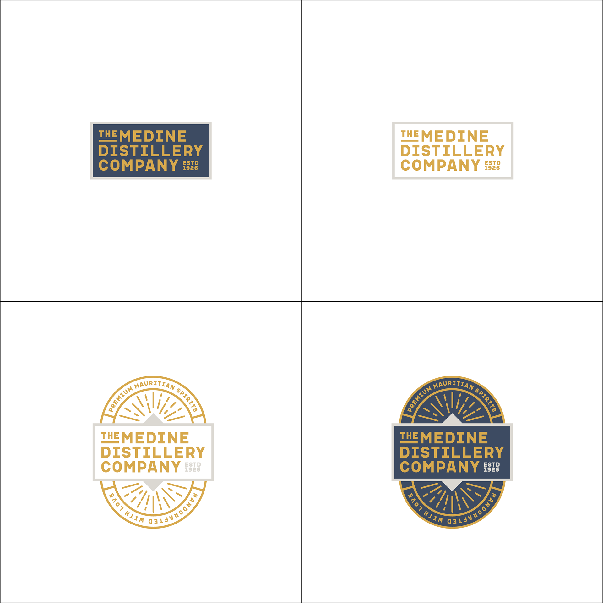
The Heritage Stamp.
This route explored a very traditional, salt-of-the-earth identity. The clean, rectangular lockup feels like a stamp burned onto a wooden crate from the distillery's early days. It was designed to convey a powerful sense of heritage, stability, and no-nonsense quality.
This exploratory phase was one of the most exciting parts of the project for me. It’s a process I really believe in—not just presenting one idea, but truly testing the different strategic paths a brand can take. It ensures that the final direction isn't just a good logo, but the right identity to carry the brand's heart into the future.