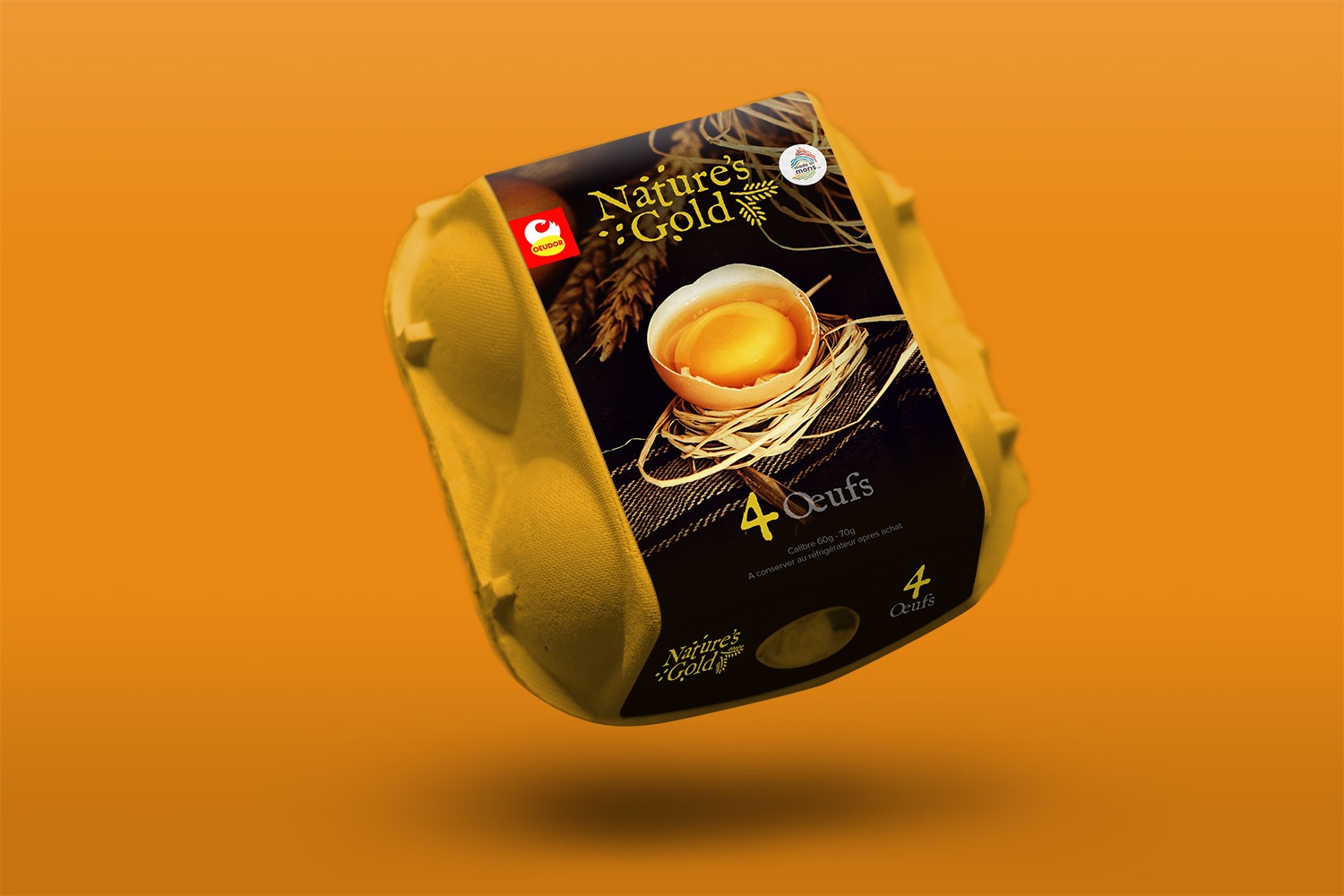
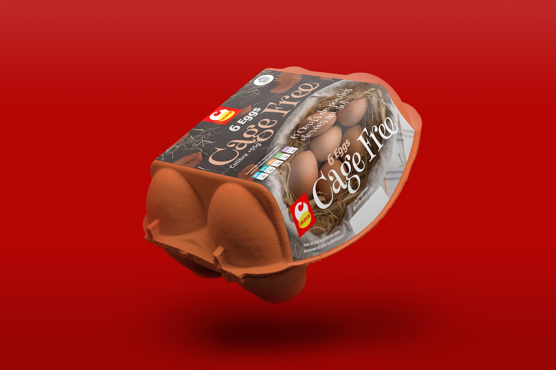
Oeudor has a whole family of different egg products, and the challenge was to figure out how to give each one its own unique personality while making it clear they all come from the same trusted brand.
The core task was a complete packaging refresh for Oeudor's diverse range of sub-brands. Each one—from "Plein Air" (Free Range) to "Nature's Gold" to "Jumbo"—had a different story to tell and a different customer to appeal to. My goal was to create a design system that would allow each product to shine on its own, but also create a cohesive look on the shelf. It was a balancing act between sub-brand individuality and parent-brand recognition.
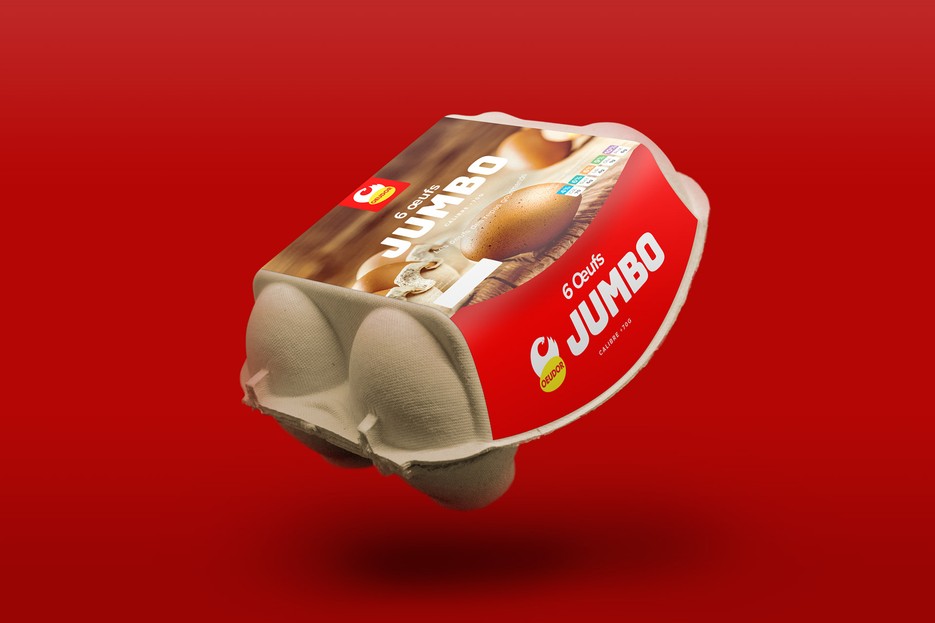
The seal.
The key to keeping it all connected was creating a flexible system for the Oeudor parent logo. On some packs it's more prominent, and on others it acts as a subtle seal of approval. This allowed us to control how much each sub-brand leaned on the main brand's reputation, depending on its market position.
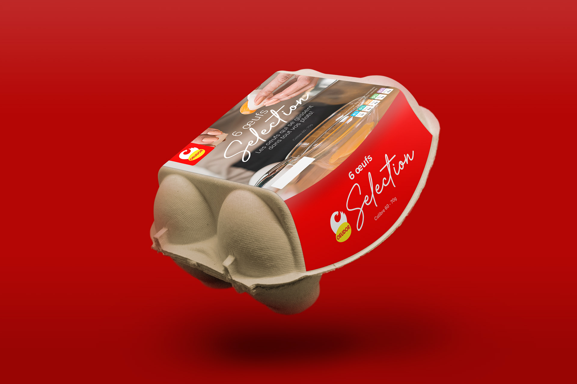
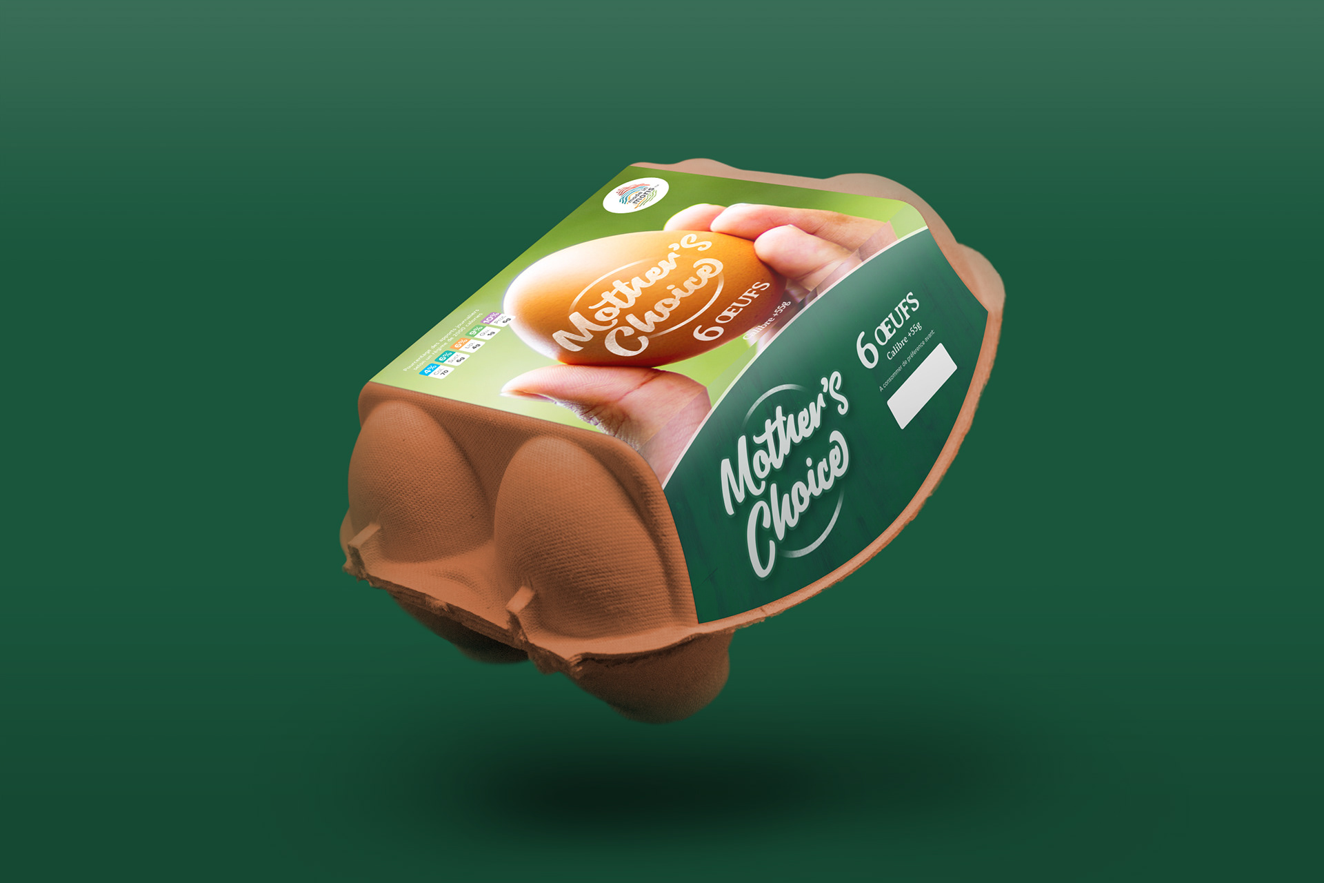
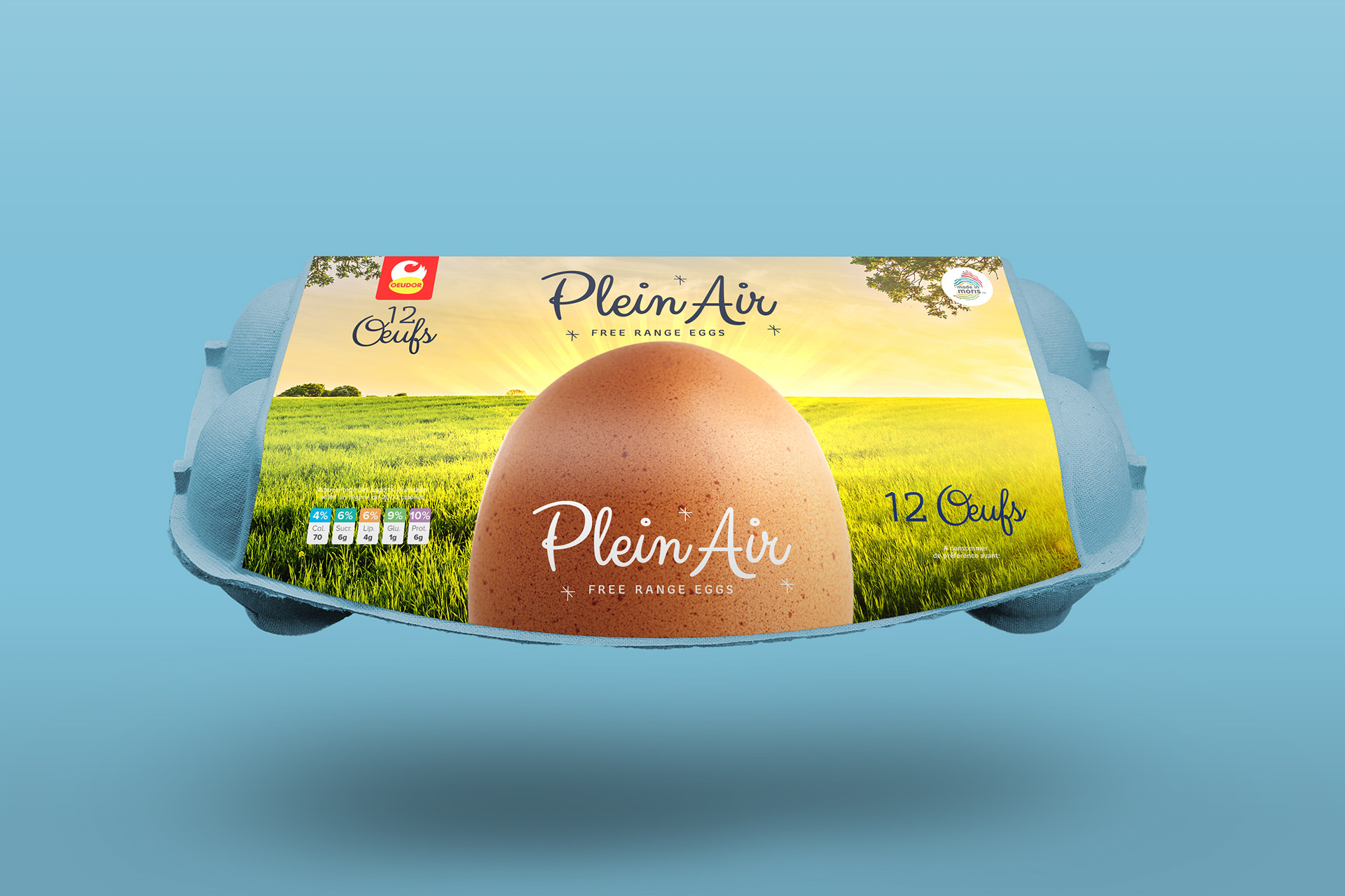
The intent.
Ultimately, this was all about making it easier for the customer. The new designs help you instantly spot the difference between the various products on a busy shelf. It was really satisfying to create a system that felt organized and intentional, helping each product communicate its specific value clearly.
I'm really proud of how this project turned out because it was a deep dive into brand strategy. It was all about managing a family of products and finding that sweet spot where each one has its own voice but still clearly belongs to the same trusted home.