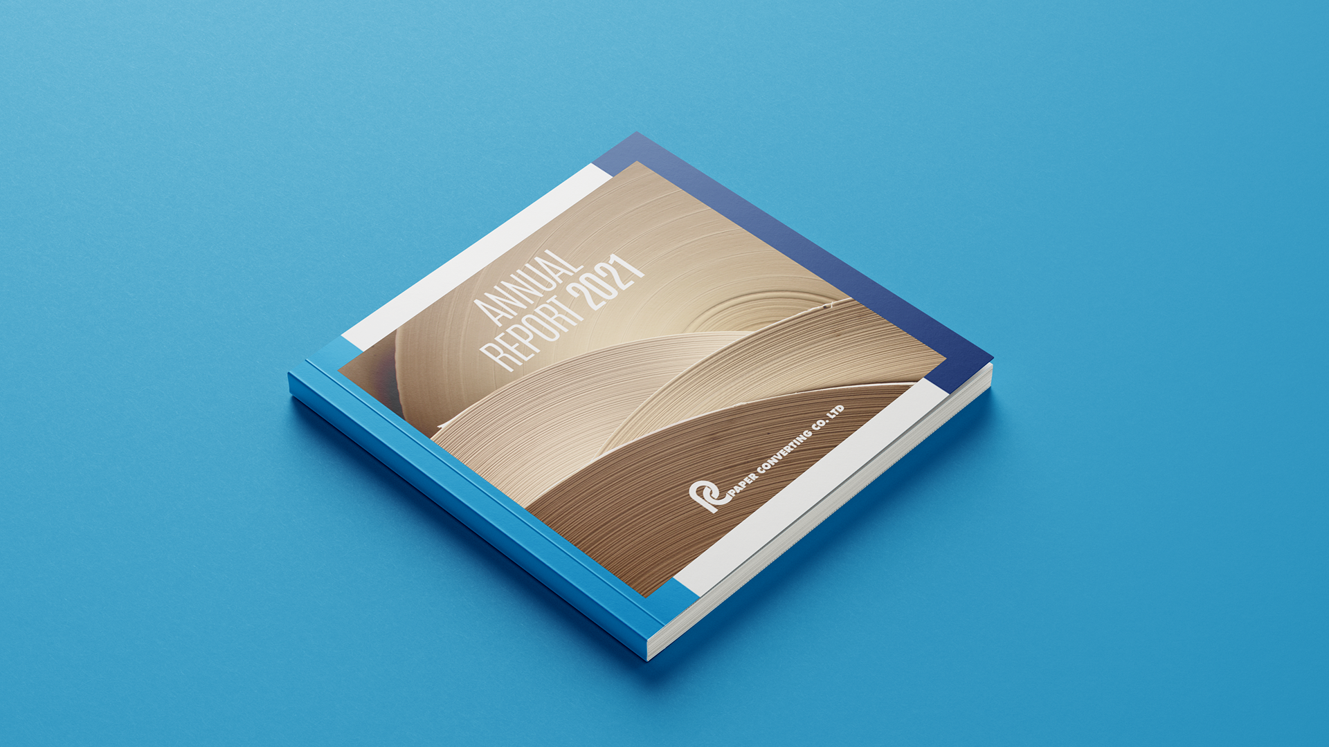
For an industrial company like PIM, an annual report needs to do more than just show numbers; it needs to tell the story of how their products are made. The creative task here was to find a powerful, direct way to visualize their commitment to the process of recycling.
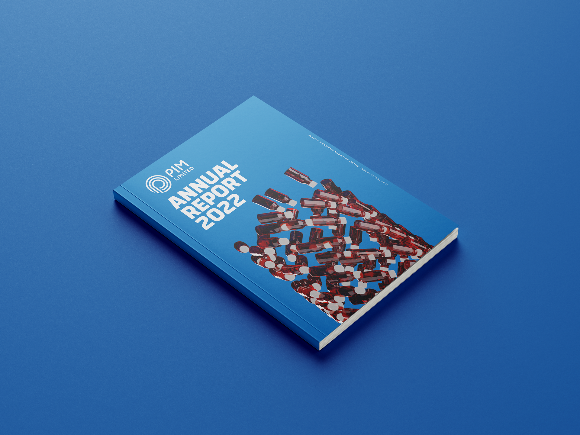
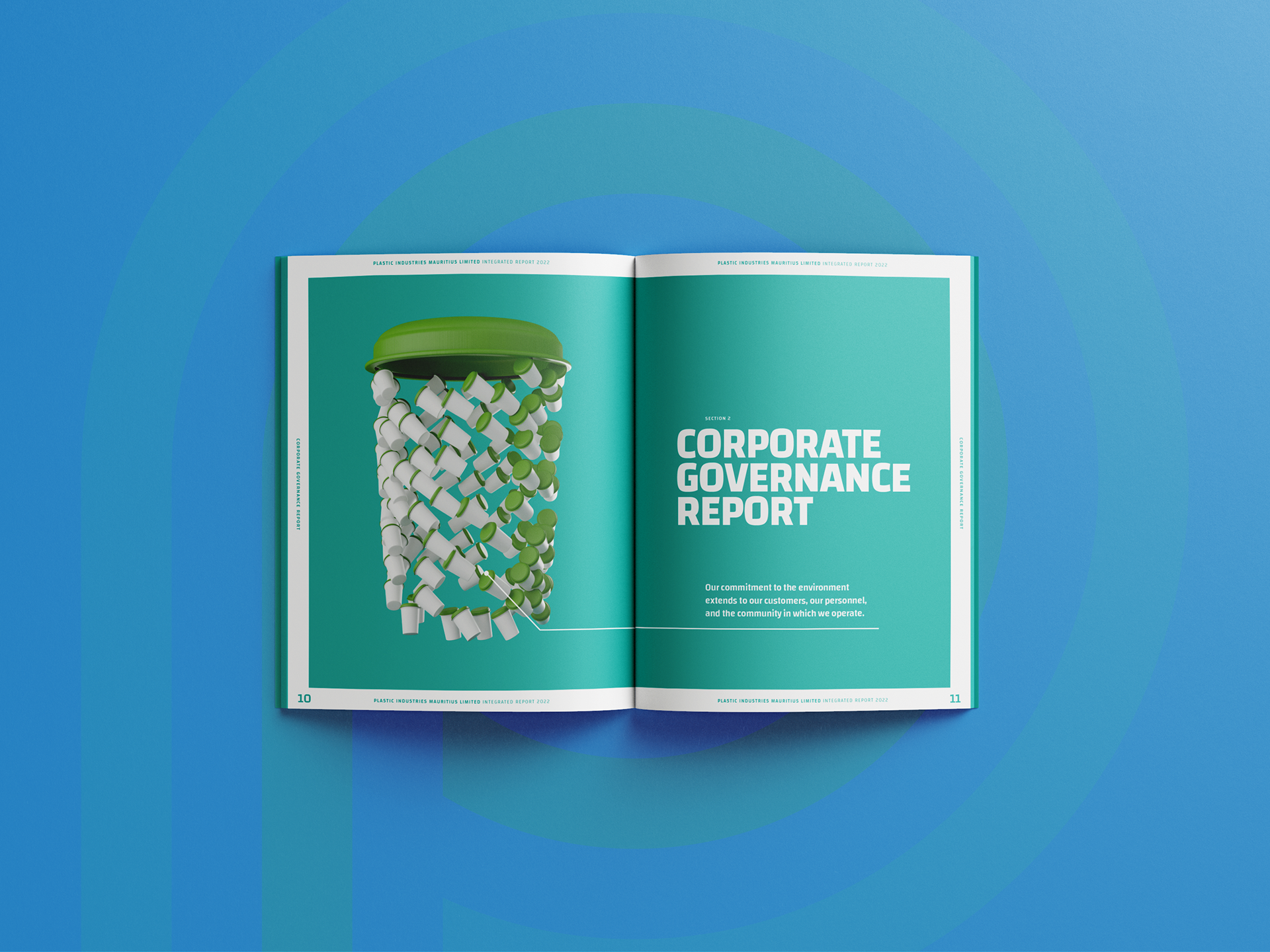
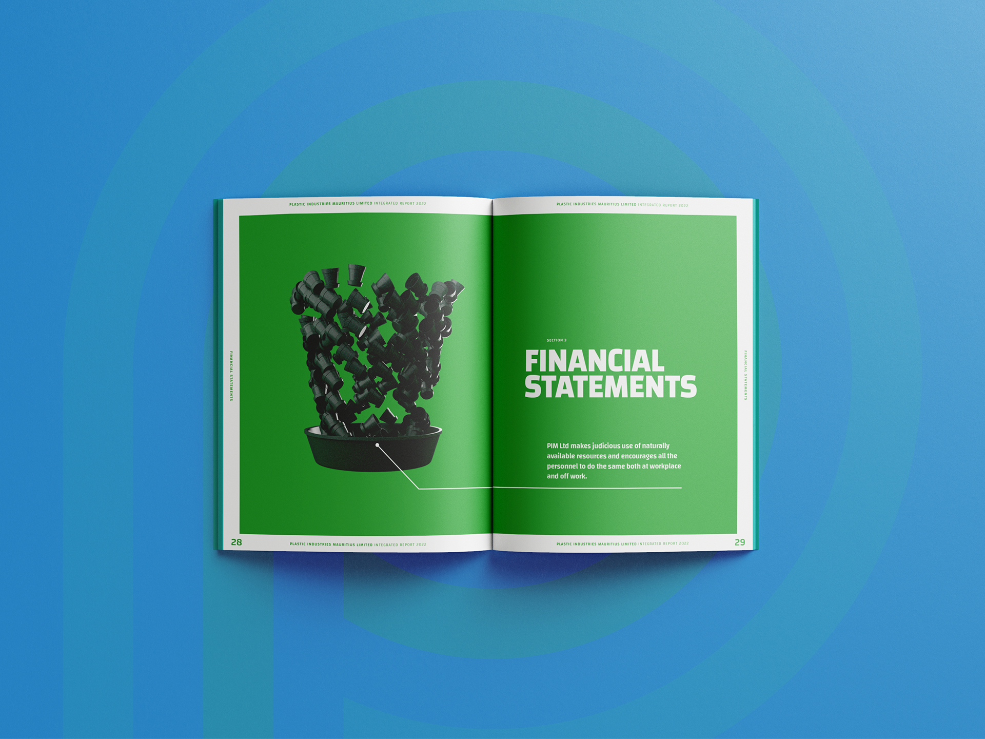
This was a design proposal for the Annual Report of PIM (Plastic Industries Mauritius Limited). The entire visual language was built around a single, clear concept: to literally show that the product is made from the product. I designed a series of powerful 3D-rendered images where large, symbolic shapes—like a bottle or a bin—are constructed entirely out of the company's own plastic components. It’s a direct visual metaphor for their circular manufacturing process.
Visualizing the Process.
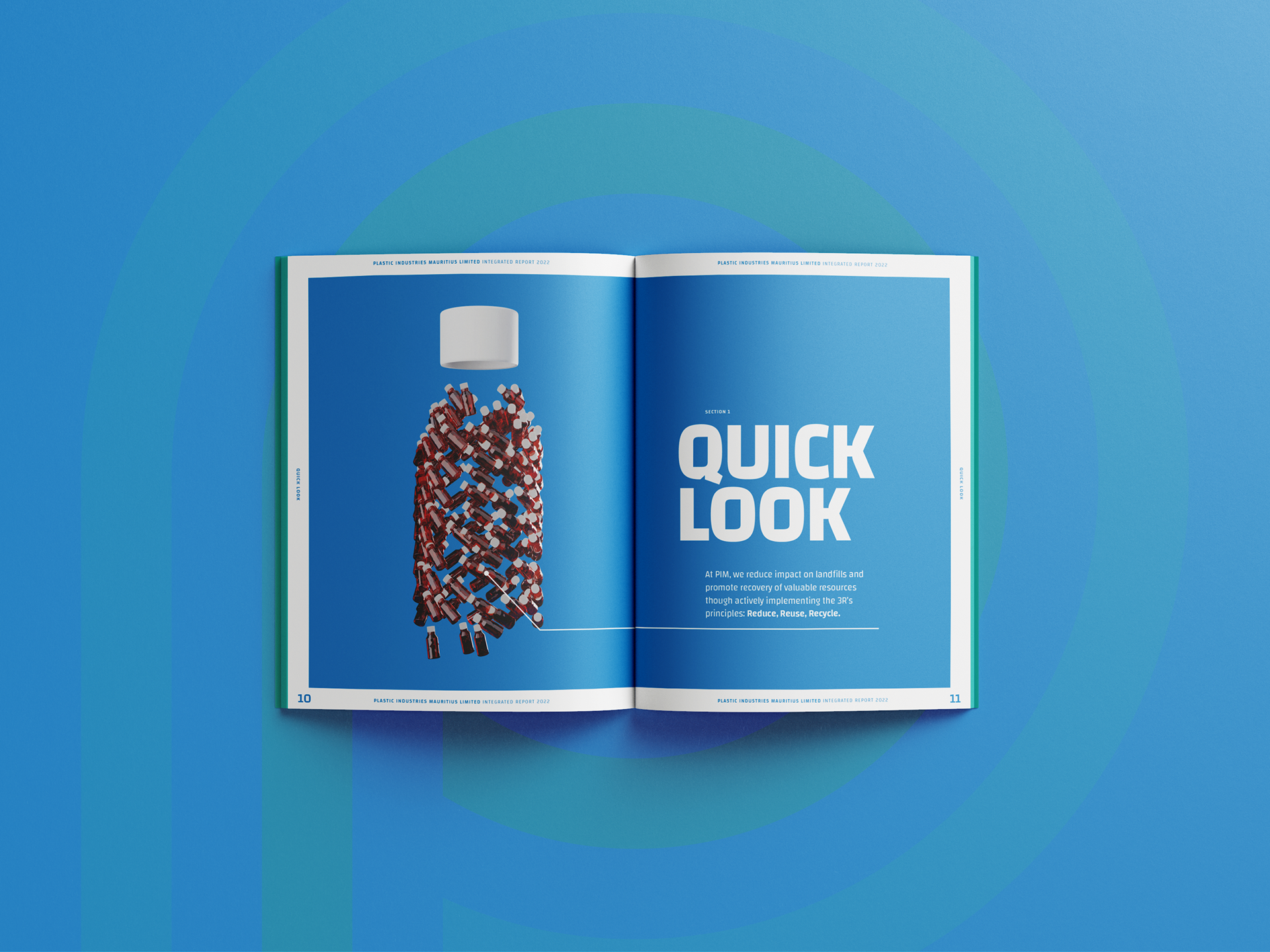
The main visual running through the report is the direct representation of recycling. For example, a shape representing a finished bottle is shown to be made of hundreds of smaller bottle preforms. This isn't an abstract image; it's a tangible depiction of how raw materials are recycled and reformed into new products.
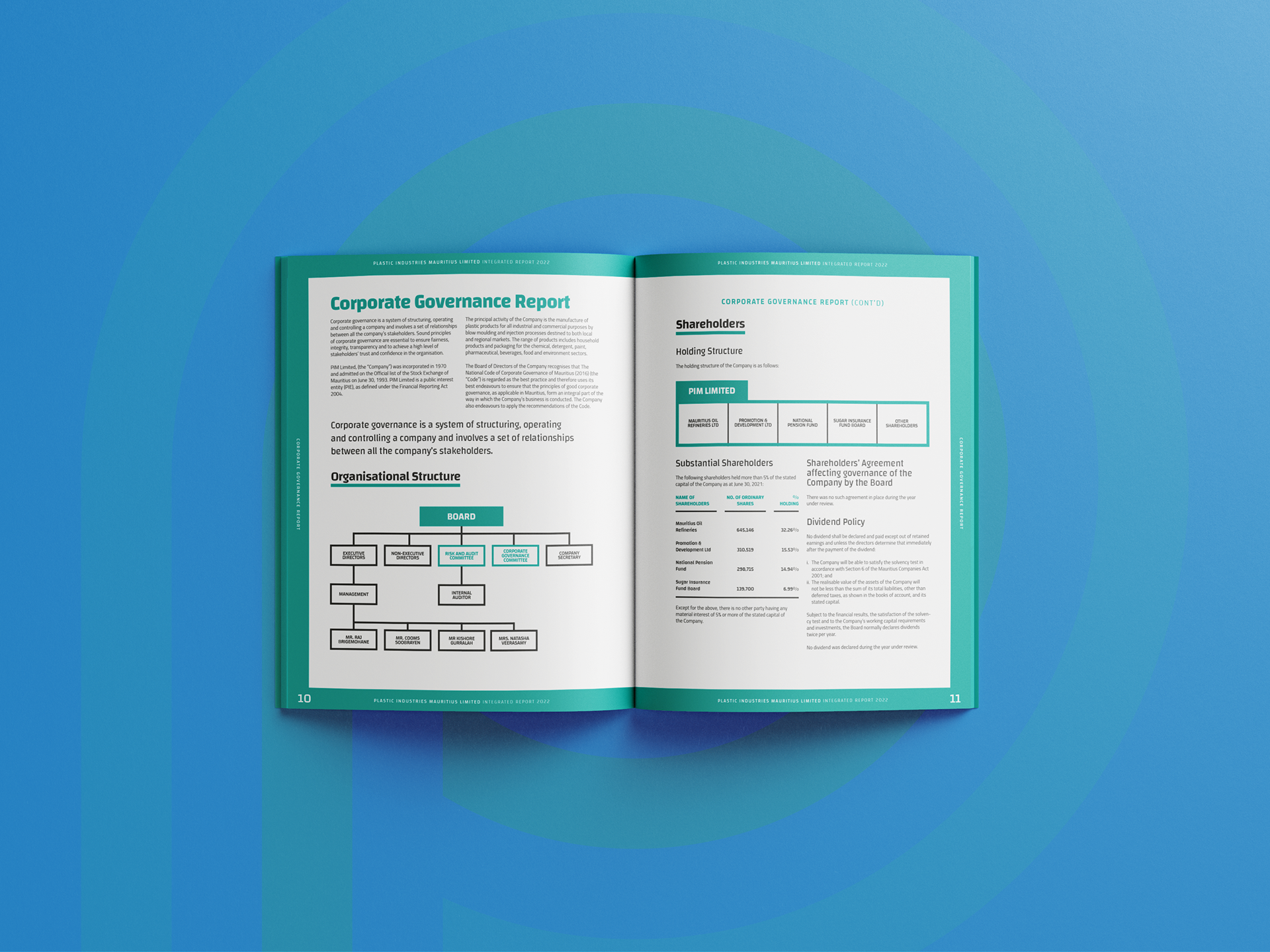
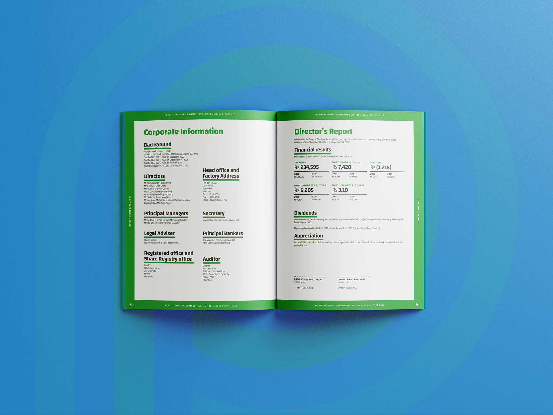
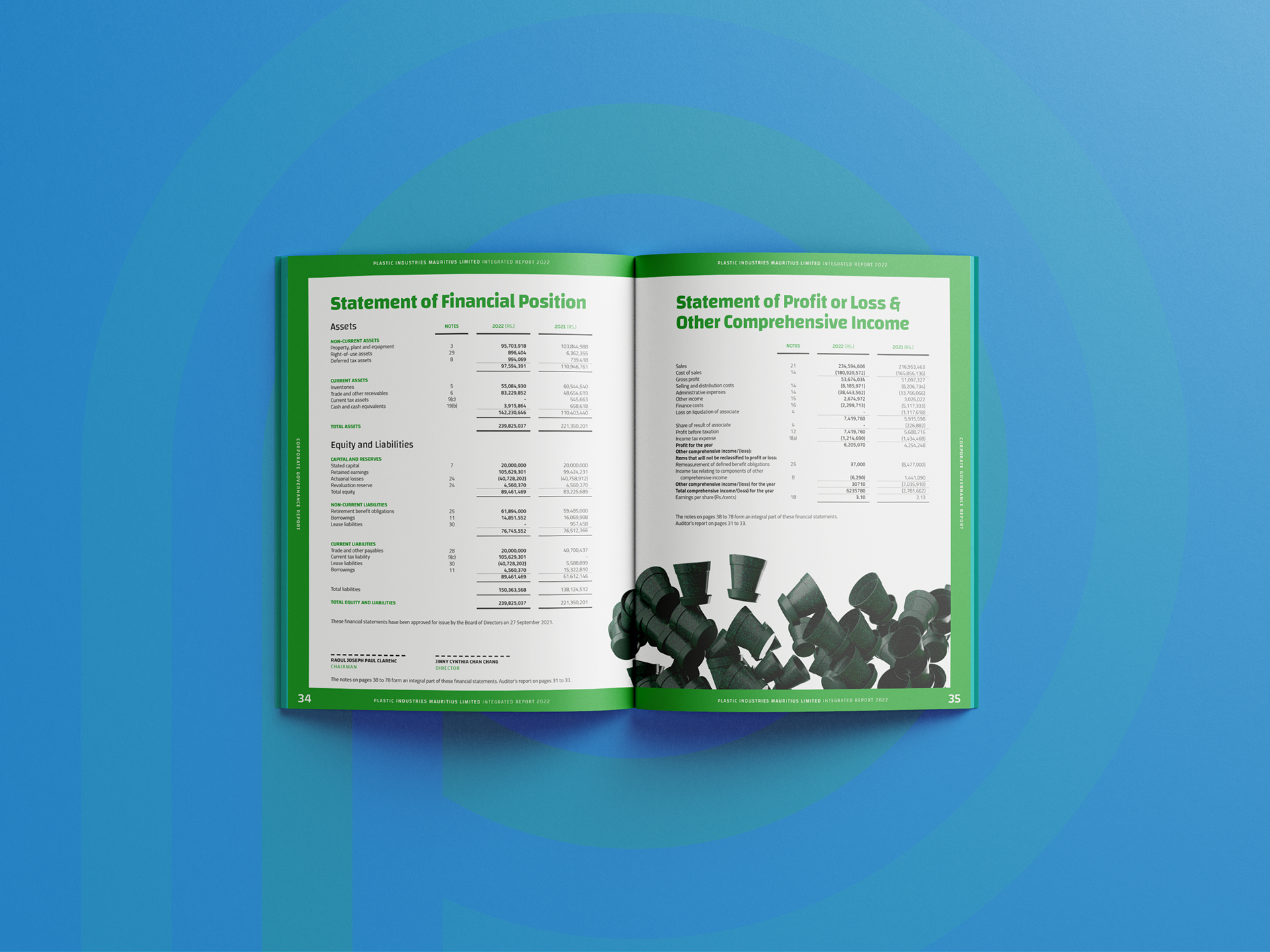
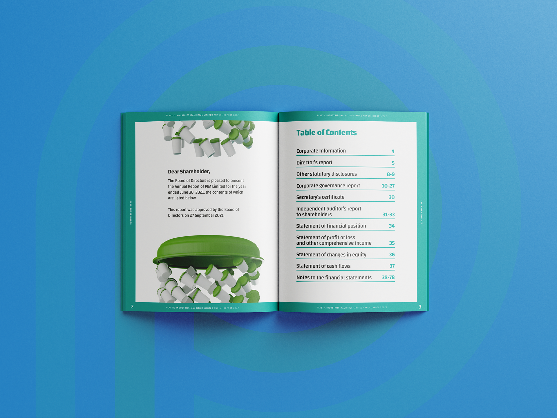
The layouts are intentionally clean and minimalist. This ensures that the corporate and financial information is perfectly legible, and it allows the conceptual images to be the heroes of each section, letting their core message land with immediate impact.
To support the sustainability theme, the clean blue and green color palette was chosen to give the report a modern, "clean-tech" feel. This consciously moves away from a dated, heavy industrial look and creates a sense of efficiency and environmental responsibility.
The challenge was to take that complex concept—circular manufacturing—and make it instantly understandable. It’s a great example of how a direct, powerful visual metaphor can communicate a company's core values more effectively than any paragraph of text ever could.