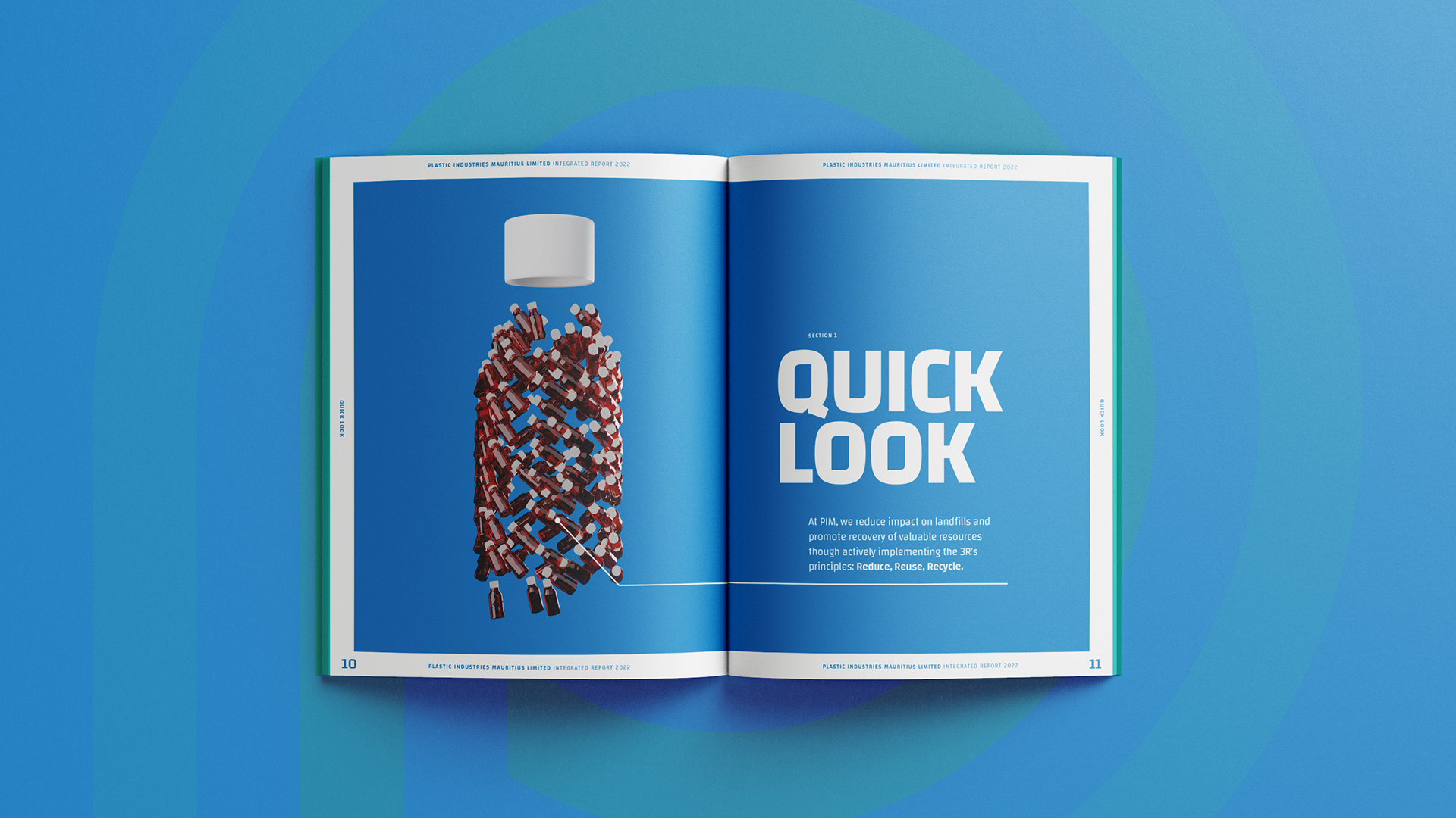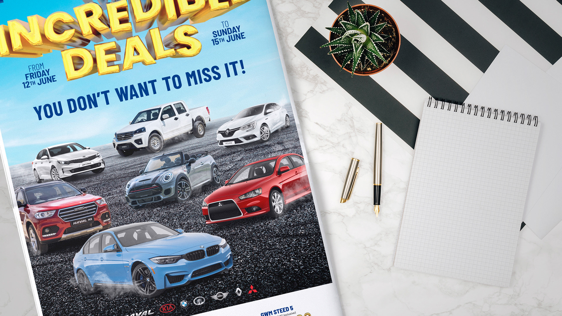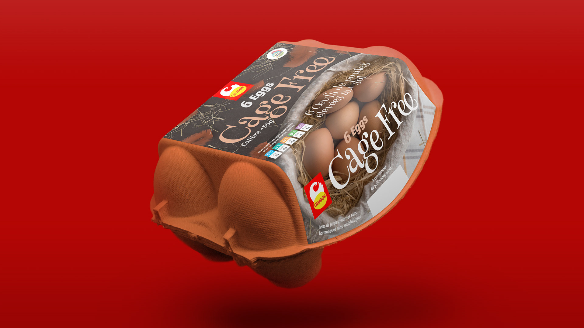
Annual reports can sometimes feel a bit dry. The real challenge for me was this: how do you make a corporate document for a paper company actually feel like paper, without being too literal?
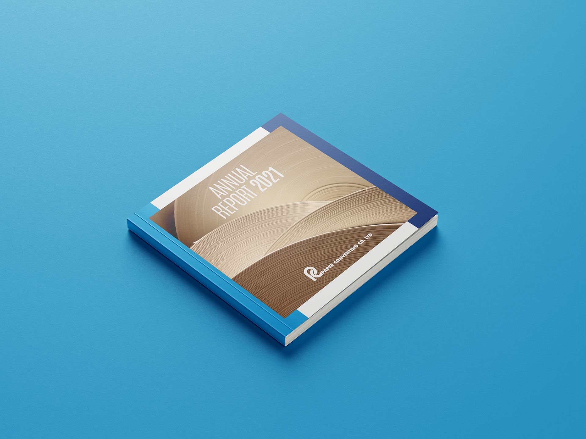
While I was at Moris Pub Ogilvy, I was tasked with designing the 2021 Annual Report for Paper Converting Co. Ltd (PCCL). The goal wasn't just to lay out their financials and corporate information cleanly, but to create a design concept that was intrinsically tied to their business. They manufacture and convert massive rolls of paper and tissue, so I wanted the report itself to echo that process in a subtle, artful way.
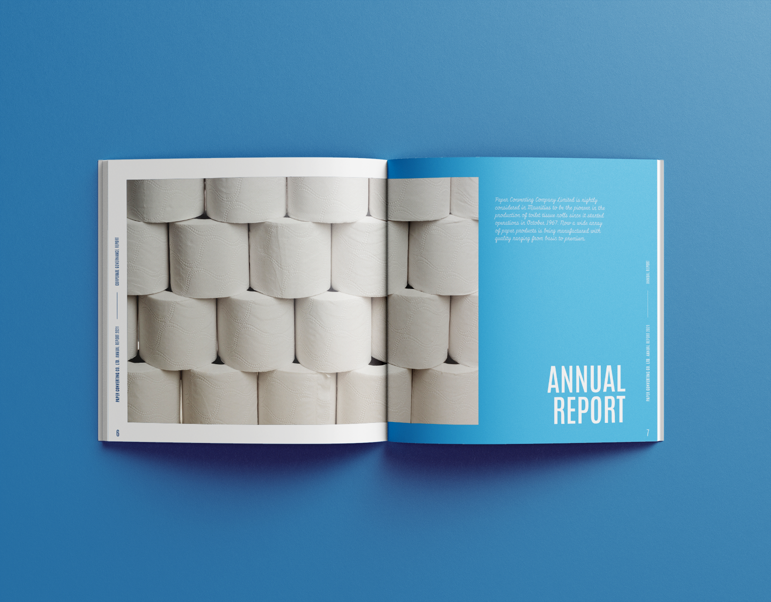
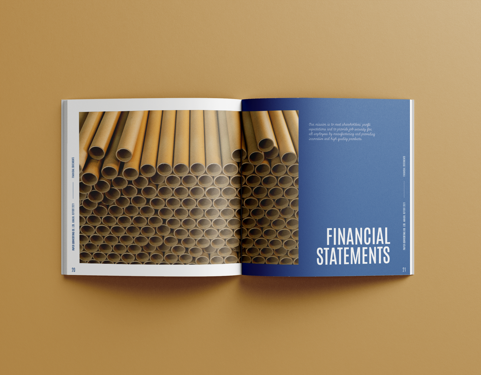
The creative anchor.
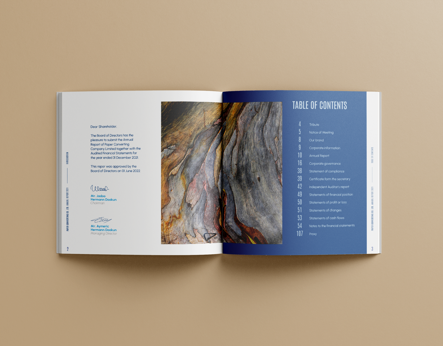
The big idea came from a simple thought: what if the entire square format of the book was a stand-in for the top-down view of a giant roll of paper? This became the creative anchor for the whole project.
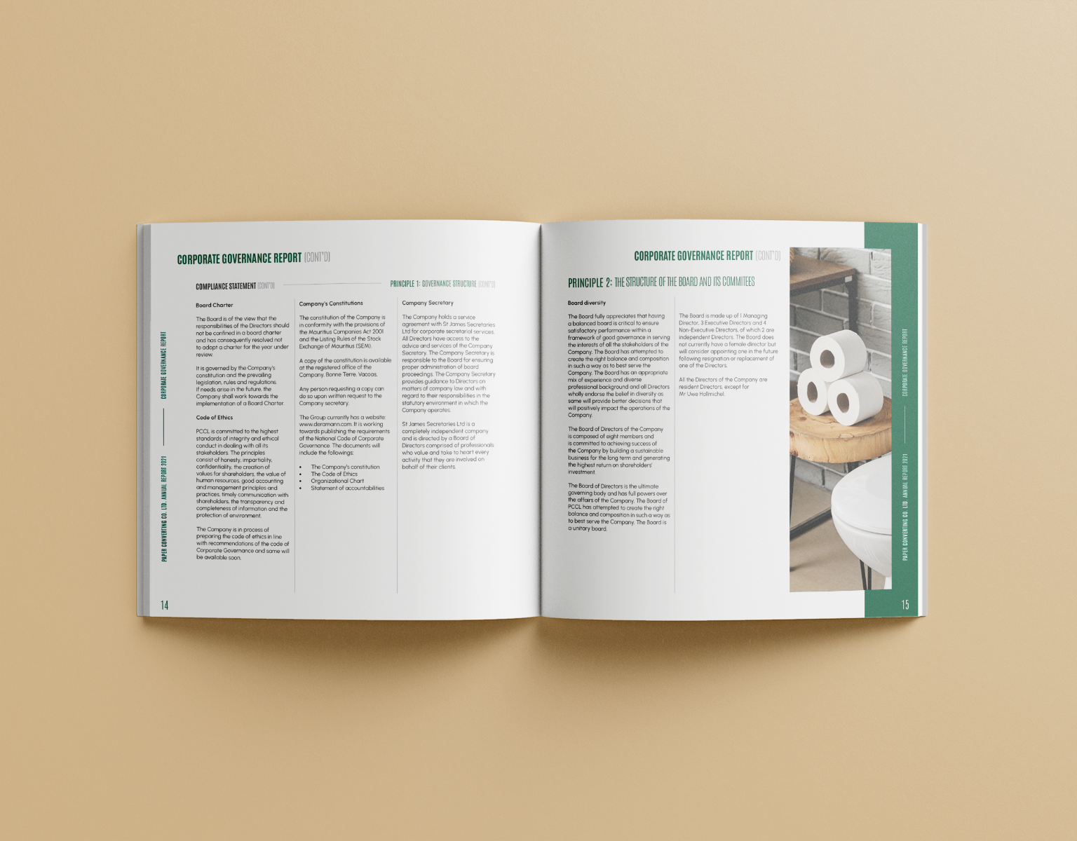
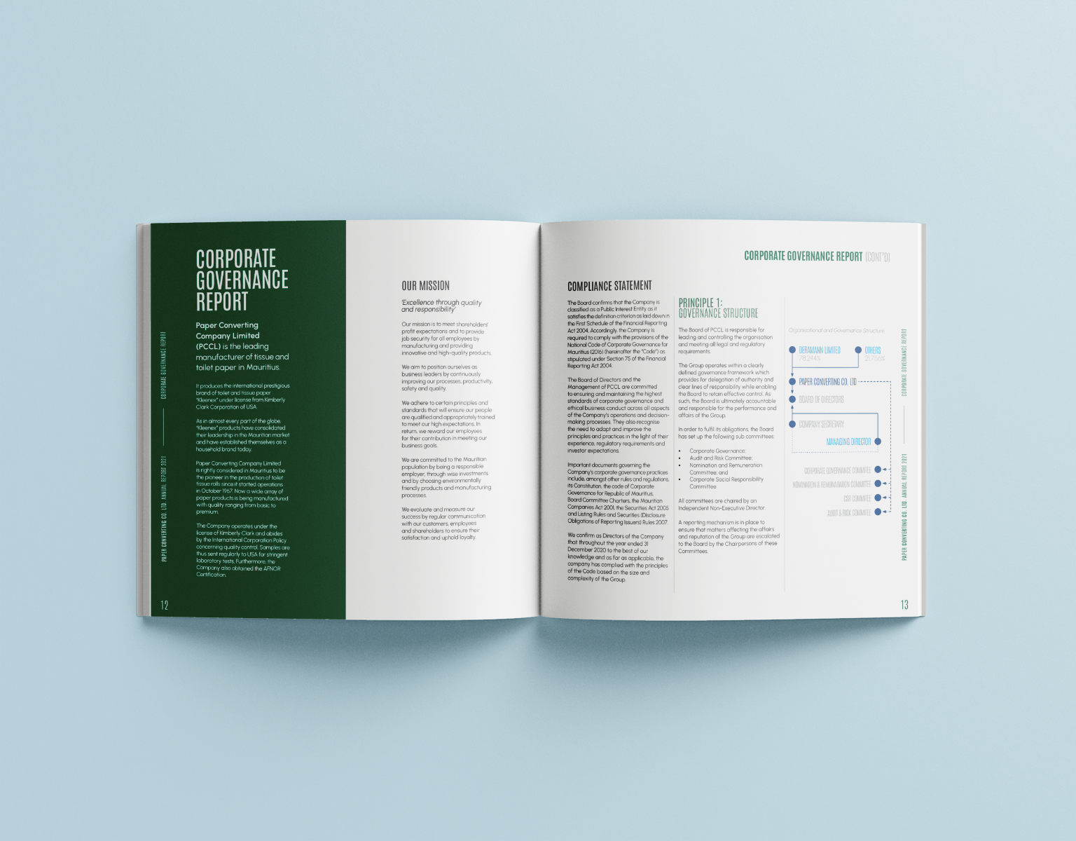
Unrolling.
Once I had that idea, it informed all the major layout decisions. You'll see images and color blocks that spill over the edge of the page or have hard, straight edges, almost as if a layer of paper is being unrolled or has been freshly torn off. It was a simple way to create a dynamic feel throughout the document.
Functional layout.
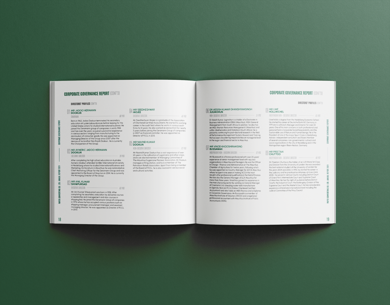
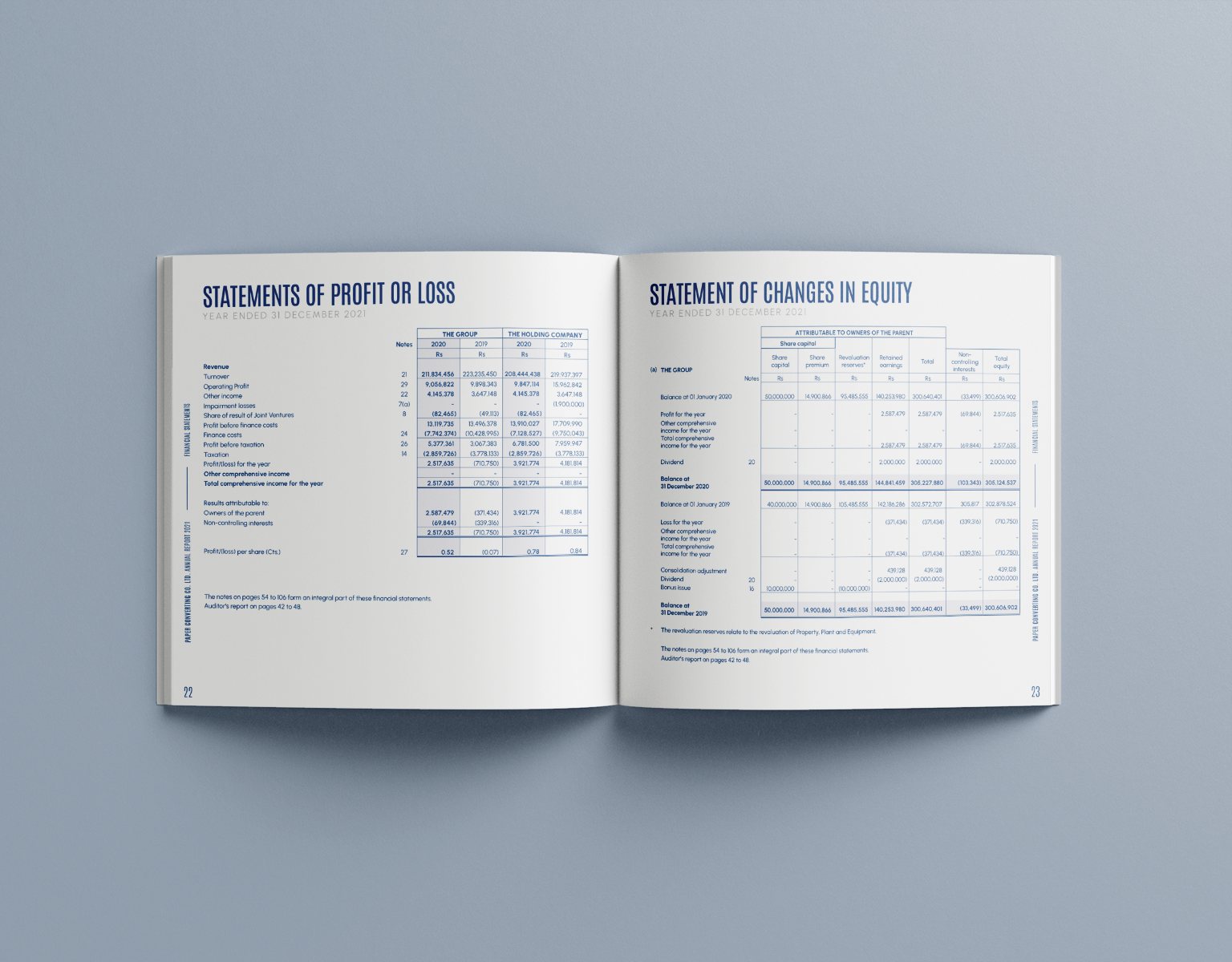
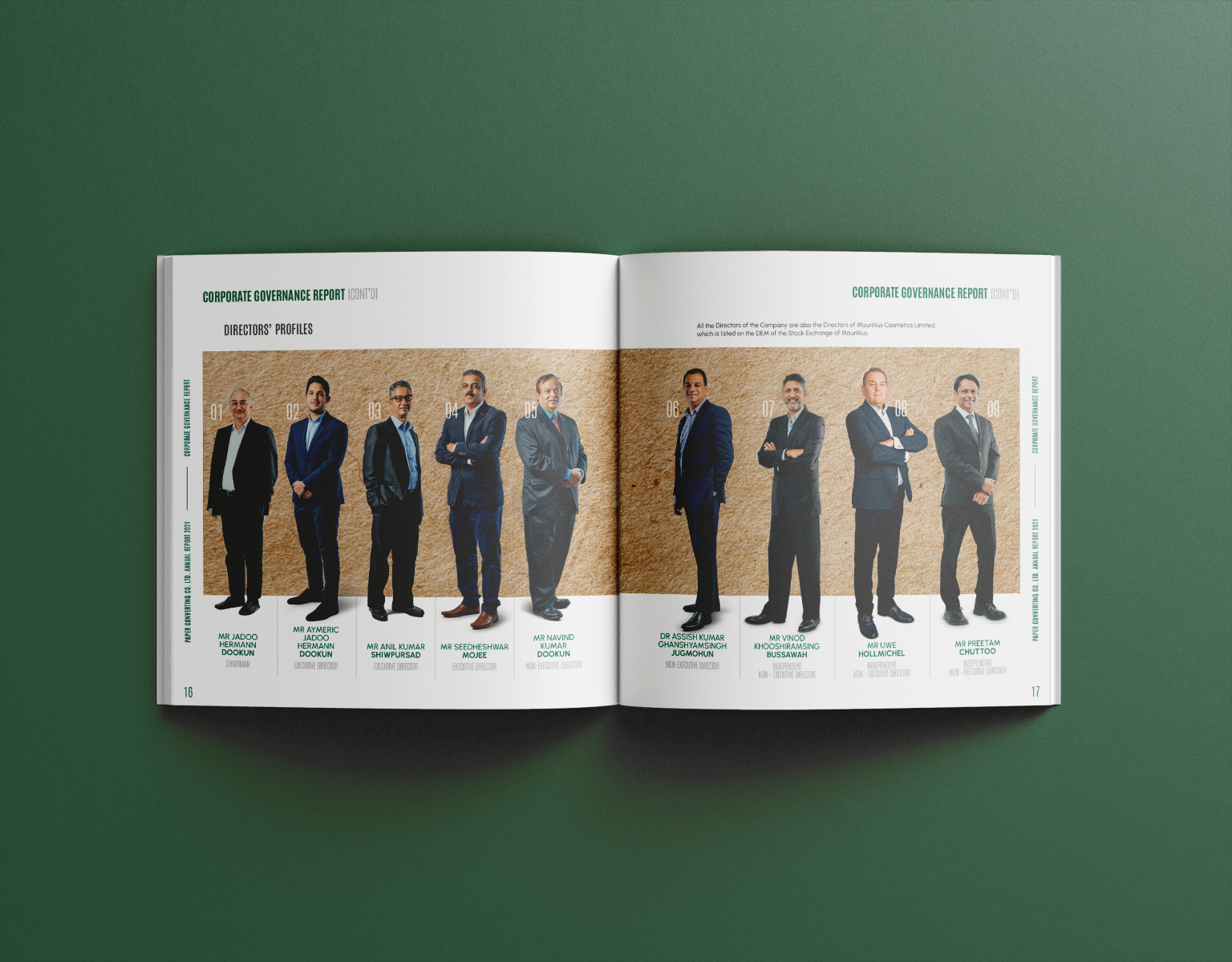
I'm also really pleased with how we balanced this creative concept with the seriousness of the content. It was important that the financial statements were still super clear and the corporate sections felt authoritative. I think we found a nice rhythm between the more expressive, abstract pages and the clean, functional layouts.
This project was a great lesson in finding a compelling story in an unexpected place. It taught me to look at the core of a client's business—even something as industrial as a paper roll—and use that as the foundation for a unique and memorable design system. It’s a project I’m proud of because the concept is woven into every page.